Sync Grid
A grid of videos on one clock. Scrub any card and the rest follow it to the same moment. Stack them to flip between versions of a single frame, or drop one onto another to compare them side by side.
- Video
- Comparison
- Scrubbing
- Motion
Uses motion, clsx, tailwind-merge
linearcubic-bezier(0.22, 1, 0.36, 1)cubic-bezier(0.65, 0, 0.35, 1)spring · bounce 0.30.00s
Left and right arrows step through frames, Shift for ten. Up and down move between cards. Space plays.
"use client";

import { cubicBezier, motion, spring, useTransform, type MotionValue } from "motion/react";

import { SyncGrid, SyncGridItem } from "@/components/ui/sync-grid";

// The motion runs over the middle of the clock, with a beat of stillness at
// each end so the start and the landing both read.
const START = 0.1;
const SPAN = 0.7;
const DURATION = 1.6;

// The graph's value range: room for the spring to overshoot.
const LOW = -0.12;
const HIGH = 1.22;

type Curve = { label: string; code: string; ease: (t: number) => number };

const curves: Curve[] = [
  { label: "Linear", code: "linear", ease: (t) => t },
  {
    label: "Ease out",
    code: "cubic-bezier(0.22, 1, 0.36, 1)",
    ease: cubicBezier(0.22, 1, 0.36, 1),
  },
  {
    label: "Ease in-out",
    code: "cubic-bezier(0.65, 0, 0.35, 1)",
    ease: cubicBezier(0.65, 0, 0.35, 1),
  },
  { label: "Spring", code: "spring · bounce 0.3", ease: springEase(0.45, 0.3) },
];

export function SyncGridDemo() {
  return (
    <div className="w-full max-w-3xl">
      <SyncGrid columns={2} duration={DURATION} fps={60} aspect={4 / 3}>
        {curves.map((curve) => (
          <SyncGridItem
            key={curve.label}
            label={curve.label}
            render={(progress) => <EasingScene progress={progress} curve={curve} />}
          />
        ))}
      </SyncGrid>
    </div>
  );
}

function EasingScene({ progress, curve }: { progress: MotionValue<number>; curve: Curve }) {
  const t = useTransform(progress, (p) => Math.min(Math.max((p - START) / SPAN, 0), 1));
  const value = useTransform(t, (v) => (v >= 1 ? 1 : curve.ease(v)));

  const dotX = useTransform(t, (v) => `${v * 100}%`);
  const dotY = useTransform(value, (v) => `${(1 - (v - LOW) / (HIGH - LOW)) * 100}%`);
  const cardY = useTransform(value, (v) => `${(1 - v) * 78}%`);
  const cardScale = useTransform(value, (v) => 0.82 + 0.18 * v);
  const cardOpacity = useTransform(value, (v) => Math.min(1, 0.35 + v * 1.6));

  return (
    <div className="@container absolute inset-0 bg-zinc-50 dark:bg-zinc-900">
      <code className="absolute top-[calc(0.625rem+1.75rem)] left-2.5 font-mono text-[max(9px,2.5cqw)] text-zinc-500 @max-3xs:hidden dark:text-zinc-400">
        {curve.code}
      </code>

      {/* The curve, with the time so far and a dot riding it. */}
      <div className="absolute bottom-[15%] left-[7%] aspect-square w-[36%]">
        <div className="absolute inset-y-0 left-0 border-l border-zinc-300 dark:border-zinc-700" />
        <div
          className="absolute inset-x-0 border-t border-zinc-300 dark:border-zinc-700"
          style={{ top: `${(HIGH / (HIGH - LOW)) * 100}%` }}
        />
        <div
          className="absolute inset-x-0 border-t border-dashed border-zinc-300 dark:border-zinc-700"
          style={{ top: `${((HIGH - 1) / (HIGH - LOW)) * 100}%` }}
        />
        <svg viewBox="0 0 100 100" preserveAspectRatio="none" className="absolute inset-0 size-full overflow-visible">
          <path
            d={pathOf(curve.ease)}
            fill="none"
            className="stroke-zinc-900 dark:stroke-zinc-100"
            strokeWidth={1.5}
            vectorEffect="non-scaling-stroke"
            strokeLinejoin="round"
          />
        </svg>
        <motion.div className="absolute inset-0" style={{ x: dotX }}>
          <div className="absolute inset-y-0 left-0 w-px bg-zinc-900/10 dark:bg-white/10" />
          <motion.div className="absolute inset-0" style={{ y: dotY }}>
            <div className="absolute top-0 left-0 size-[max(7px,2.4cqw)] -translate-x-1/2 -translate-y-1/2 rounded-full bg-zinc-900 ring-[max(2px,0.7cqw)] ring-zinc-50 dark:bg-white dark:ring-zinc-900" />
          </motion.div>
        </motion.div>
      </div>

      {/* The same value moving something: a card rising into its slot. */}
      <div className="absolute top-[24%] right-[7%] bottom-[15%] w-[42%] overflow-hidden rounded-[3.5cqw] bg-white ring-1 ring-zinc-900/[0.06] dark:bg-zinc-950 dark:ring-white/[0.06]">
        <div className="absolute inset-x-[9%] top-[10%] h-[2.6cqw] w-[38%] rounded-full bg-zinc-200 dark:bg-zinc-800" />
        <div className="absolute inset-x-[9%] top-[22%] h-[2cqw] w-[58%] rounded-full bg-zinc-100 dark:bg-zinc-900" />
        <div className="absolute inset-x-[7%] top-[38%] bottom-[8%] rounded-[2.6cqw] border border-dashed border-zinc-300 dark:border-zinc-700" />
        <motion.div
          className="absolute inset-x-[7%] top-[38%] bottom-[8%] flex flex-col justify-between rounded-[2.6cqw] bg-zinc-900 p-[3.2cqw] shadow-lg shadow-zinc-900/15 dark:bg-zinc-100 dark:shadow-black/40"
          style={{ y: cardY, scale: cardScale, opacity: cardOpacity }}
        >
          <div className="flex items-center gap-[2cqw]">
            <div className="size-[5cqw] rounded-full bg-gradient-to-br from-amber-300 to-rose-400" />
            <div className="flex flex-1 flex-col gap-[1.2cqw]">
              <div className="h-[1.6cqw] w-[70%] rounded-full bg-white/80 dark:bg-zinc-900/80" />
              <div className="h-[1.4cqw] w-[45%] rounded-full bg-white/35 dark:bg-zinc-900/35" />
            </div>
          </div>
          <div className="h-[4.4cqw] rounded-[1.4cqw] bg-white/15 dark:bg-zinc-900/10" />
        </motion.div>
      </div>
    </div>
  );
}

/** The curve as an SVG path in a 100 × 100 box, value range LOW to HIGH. */
function pathOf(ease: (t: number) => number) {
  const points: string[] = [];
  for (let i = 0; i <= 96; i++) {
    const t = i / 96;
    const v = t >= 1 ? 1 : ease(t);
    points.push(`${(t * 100).toFixed(2)},${((1 - (v - LOW) / (HIGH - LOW)) * 100).toFixed(2)}`);
  }
  return `M${points.join("L")}`;
}

/** A spring sampled over the motion's span, so it reads as an easing curve. */
function springEase(visualDuration: number, bounce: number) {
  const generator = spring({ keyframes: [0, 1], visualDuration, bounce });
  const length = DURATION * SPAN * 1000;
  return (t: number) => generator.next(t * length).value;
}
Installation
Add the component on its own with the CLI, or copy the file in by hand.
The CLI writes components/ui/sync-grid.tsx and installs motion, clsx and tailwind-merge. It needs the @keyframeui registry in components.json; add it once per project.
npx shadcn@latest add @keyframeui/sync-gridInstall the dependencies
npm i motion clsx tailwind-mergeAdd the cn helper
Skip this if you already use shadcn/ui.
lib/utils.tsimport { clsx, type ClassValue } from "clsx"; import { twMerge } from "tailwind-merge"; export function cn(...inputs: ClassValue[]) { return twMerge(clsx(inputs)); }Copy the source into your project
components/ui/sync-grid.tsx"use client"; import * as React from "react"; import { AnimatePresence, animate, cancelFrame, frame, motion, motionValue, useMotionValue, useReducedMotion, useTransform, type AnimationPlaybackControlsWithThen, type MotionValue, type Transition, } from "motion/react"; import { cn } from "@/lib/utils"; /* ───────────────────────────────────────────────────────── * SYNC GRID STORYBOARD * * scrub move the pointer across any card: the clock follows * its x. That card leads, with a ring, a thicker line * and a timestamp riding its playhead. Leave, and * every card keeps the moment * ripple the others chase the leader on springs that slow * with each cell of distance, so time washes outward * across the grid. 150ms after the pointer stops they * all sit on exactly the same frame * play Space or ▶: every card plays on the one clock. * Videos play natively, nudged back into line when * they drift. Off screen, everything pauses * stack the cards fly into one frame, fanned behind the * front one. x scrubs, y picks the variant, which * swaps in a 100ms crossfade on the same frame * compare drag a card onto another (long-press on touch): * they merge into one frame with a divider, or layer * in Difference so only what changed glows * hint the first time the grid is seen, a ghost cursor * sweeps the first card once * reduce no ripple, no flights (a quick fade), no hint * * Nothing renders React per frame. One frame loop moves the * clock and the followers; cards listen to motion values and * write styles directly. Videos that share a source decode * once and are drawn into each card's canvas. * ───────────────────────────────────────────────────────── */ const SYNC = { // A follower's spring, as motion's visualDuration in s: base plus step per // cell from the leader, with the step shrunk so the farthest card stays // under max. ripple: { base: 0.06, step: 0.04, max: 0.14 }, settle: 0.15, // s after the clock stops until every card is on the leader's frame fly: { type: "spring", visualDuration: 0.5, bounce: 0.16 }, stagger: 0.035, // s of flight delay per cell from the card that led fan: { type: "spring", visualDuration: 0.3, bounce: 0.12 }, lift: { type: "spring", visualDuration: 0.28, bounce: 0.22 }, glide: { type: "spring", visualDuration: 0.25, bounce: 0.12 }, // highlights wipe: { type: "spring", visualDuration: 0.45, bounce: 0.08 }, // the divider opening swap: { duration: 0.1, ease: "linear" }, // stack variants crossfade fade: { duration: 0.16, ease: "easeOut" }, instant: { duration: 0 }, inset: 12, // px between a card's edges and its timeline press: 5, // px a mouse press travels before it lifts the card slop: 8, // px a touch travels before it commits to scrubbing longPress: 350, // ms a touch holds still to lift the card hysteresis: 0.12, // share of a band the pointer crosses before the stack switches ring: 10, // decoded frames kept per shared video, so followers can lag behind drift: { seek: 0.25, gain: 0.4, cap: 0.1 }, // s off before a hard seek; playbackRate nudge } as const; // Cards behind the front one, by depth: a few px up, a degree or two off, and // a little darker the further back they sit. const FAN = [ { x: 0, y: 0, rotate: 0, shade: 0 }, { x: -3, y: -9, rotate: -1.5, shade: 0.07 }, { x: 4, y: -17, rotate: 1.2, shade: 0.13 }, { x: -2, y: -24, rotate: -1.9, shade: 0.19 }, ]; const FAN_ROOM = 26; // px above the stack for the fan to show type Mode = "grid" | "stack" | "compare"; type View = "split" | "difference"; export type SyncGridSprite = { /** Image URL of the sheet: frames left to right, then top to bottom. */ url: string; columns: number; rows: number; /** How many cells hold frames. Defaults to `columns × rows`. */ frames?: number; }; // ── Clock ─────────────────────────────────────────────────── type Card = { index: number; /** This card's own time, 0–1. Followers spring toward the clock. */ shown: MotionValue<number>; velocity: number; lead: MotionValue<number>; // 0–1: ring, thick line, timestamp glow: MotionValue<number>; // 0–1: a lifted card is over it lift: MotionValue<number>; // 0–1: picked up aim: MotionValue<number>; // 0–1: picked up and over a card to drop on dragX: MotionValue<number>; dragY: MotionValue<number>; element: HTMLElement | null; }; type CardInit = Omit<Card, "index" | "velocity">; function createGrid() { const time = motionValue(0); // 1 while videos should show over sprites: playing, or paused after playing. const live = motionValue(0); const divider = motionValue(0.5); const cards = new Map<number, Card>(); const decoders = new Map<string, Decoder>(); const sliders = new Set<HTMLElement>(); const settings = { duration: 4, fps: 30, columns: 2, ripple: true, mode: "grid" as Mode }; const state = { leader: 0, reach: 1, // cells from the leader to the farthest card playing: false, played: false, near: false, // within a screen of the viewport: videos may load changed: 0, // when the clock last moved, other than by playing running: false, announce: 0, emphasized: null as number | null, }; const listeners = { play: null as ((playing: boolean) => void) | null, duration: null as ((seconds: number) => void) | null, interrupt: null as (() => void) | null, }; let park: HTMLElement | null = null; const frames = () => Math.max(1, Math.round(settings.duration * settings.fps)); const cellOf = (i: number) => ({ x: i % settings.columns, y: Math.floor(i / settings.columns) }); const distance = (a: number, b: number) => { const p = cellOf(a); const q = cellOf(b); return Math.hypot(p.x - q.x, p.y - q.y); }; const rippleOf = (i: number) => { const { base, step, max } = SYNC.ripple; return base + Math.min(step, (max - base) / state.reach) * distance(i, state.leader); }; const tick = ({ delta }: { delta: number }) => { const dt = Math.min(delta, 50) / 1000; if (state.playing) time.set((time.get() + dt / settings.duration) % 1); const target = time.get(); const exact = state.playing || !settings.ripple || settings.mode !== "grid" || performance.now() - state.changed > SYNC.settle * 1000; const half = 0.5 / frames(); let moving = state.playing; for (const card of cards.values()) { const shown = card.shown.get(); if (exact || card.index === state.leader) { card.velocity = 0; if (shown !== target) card.shown.set(target); continue; } // A critically damped spring, stepped exactly, keeping its velocity // however often the target moves. const omega = (2 * Math.PI) / (1.2 * rippleOf(card.index)); const decay = Math.exp(-omega * dt); const x0 = shown - target; const c = card.velocity + omega * x0; const x = (x0 + c * dt) * decay; card.velocity = (card.velocity - omega * c * dt) * decay; if (Math.abs(x) < half) { // The last fraction of a frame: land exactly. card.velocity = 0; card.shown.set(target); } else { card.shown.set(target + x); moving = true; } } for (const decoder of decoders.values()) decoder.sync(); if (!moving && performance.now() - state.changed > SYNC.settle * 1000) stop(); }; const wake = () => { if (state.running) return; state.running = true; frame.update(tick, true); }; const stop = () => { state.running = false; cancelFrame(tick); }; const announce = () => { window.clearTimeout(state.announce); state.announce = window.setTimeout(() => { const seconds = time.get() * settings.duration; for (const slider of sliders) { slider.setAttribute("aria-valuenow", seconds.toFixed(2)); slider.setAttribute("aria-valuetext", spoken(seconds, settings.duration)); } }, 120); }; time.on("change", () => { if (!state.playing) { state.changed = performance.now(); announce(); } wake(); }); const setLeader = (index: number) => { if (state.leader === index) return; state.leader = index; let reach = 1; for (const i of cards.keys()) reach = Math.max(reach, distance(i, index)); state.reach = reach; const card = cards.get(index); if (card) card.velocity = 0; }; const emphasize = (index: number | null) => { if (state.emphasized === index) return; state.emphasized = index; for (const card of cards.values()) { animate(card.lead, card.index === index ? 1 : 0, SYNC.fade); } }; const setPlaying = (playing: boolean) => { if (state.playing === playing) return; state.playing = playing; if (playing) { state.played = true; live.set(1); if (time.get() >= 1 - 0.5 / frames()) time.jump(0); for (const decoder of decoders.values()) decoder.play(); wake(); } else { state.changed = performance.now(); for (const decoder of decoders.values()) decoder.pause(); announce(); } listeners.play?.(playing); }; const grid = { time, live, divider, cards, settings, state, listeners, sliders, configure(next: Partial<typeof settings>) { const durationChanged = next.duration !== undefined && next.duration !== settings.duration; Object.assign(settings, next); if (durationChanged) announce(); wake(); }, register(index: number, init: CardInit) { const card: Card = { index, velocity: 0, ...init }; cards.set(index, card); let reach = 1; for (const i of cards.keys()) reach = Math.max(reach, distance(i, state.leader)); state.reach = reach; return () => { if (cards.get(index) === card) cards.delete(index); }; }, distance, setLeader, emphasize, /** Sets the clock from a card: it leads. */ scrub(index: number, progress: number) { if (state.playing) setPlaying(false); setLeader(index); live.set(0); time.set(clamp(progress, 0, 1)); }, /** Moves `count` frames, landing on a frame boundary. */ step(index: number, count: number) { if (state.playing) setPlaying(false); setLeader(index); live.set(0); const total = frames(); time.set(clamp(Math.round(time.get() * total) + count, 0, total) / total); }, setPlaying, toggle() { setPlaying(!state.playing); }, interrupt() { listeners.interrupt?.(); }, /** Hooks the component's callbacks in; returns a function that unhooks them. */ listen(next: Partial<typeof listeners>) { Object.assign(listeners, next); return () => { for (const key of Object.keys(next) as (keyof typeof listeners)[]) { if (listeners[key] === next[key]) listeners[key] = null; } }; }, setPark(element: HTMLElement | null) { park = element; }, get park() { return park; }, setNear(near: boolean) { state.near = near; if (near) for (const decoder of decoders.values()) decoder.load(); }, attach(src: string, consumer: Consumer) { let decoder = decoders.get(src); if (!decoder) { decoder = createDecoder(src, grid); decoders.set(src, decoder); } decoder.attach(consumer); const owner = decoder; return () => { owner.detach(consumer); // Strict mode and quick remounts re-attach straight away; wait a tick // before tearing the video down. window.setTimeout(() => { if (owner.empty() && decoders.get(src) === owner) { owner.dispose(); decoders.delete(src); } }, 0); }; }, decoderOf(src: string) { return decoders.get(src) ?? null; }, reportDuration(seconds: number) { listeners.duration?.(seconds); }, dispose() { stop(); window.clearTimeout(state.announce); }, }; return grid; } type Grid = ReturnType<typeof createGrid>; // ── Video ─────────────────────────────────────────────────── type Consumer = { index: number; shown: MotionValue<number>; resolution: number; /** Sprite items: the video only loads for playback. */ lazy: boolean; holder: HTMLElement; canvas: HTMLCanvasElement; context: CanvasRenderingContext2D | null; drawn: number; onReady: () => void; /** The source's size is known: size the canvas against it. */ refit: () => void; }; type Slot = { canvas: HTMLCanvasElement; context: CanvasRenderingContext2D | null; time: number; id: number }; type VideoFrameVideo = HTMLVideoElement & { requestVideoFrameCallback?: (callback: () => void) => number; cancelVideoFrameCallback?: (handle: number) => void; }; /** * One `<video>` per source. A source with a single full-resolution card plays * in that card; otherwise the video stays hidden and every decoded frame is * drawn into each card's canvas. Recent frames are kept in a small ring, so a * card that's still catching up shows the frame nearest its own time. * * Seeks coalesce: one is in flight at a time, and when it lands the next goes * straight to the newest target. Only ever draws, never reads pixels, so * cross-origin videos are fine. */ function createDecoder(src: string, grid: Grid) { const video: VideoFrameVideo = document.createElement("video"); video.muted = true; video.playsInline = true; video.preload = "auto"; video.disablePictureInPicture = true; video.setAttribute("aria-hidden", "true"); video.setAttribute("tabindex", "-1"); video.className = "pointer-events-none absolute inset-0 size-full object-cover"; const consumers = new Set<Consumer>(); const ring: Slot[] = []; let direct: Consumer | null = null; let loaded = false; let ready = false; let failed = false; let seeking = false; let fastLast = false; let playing = false; let target = 0; let ids = 0; let callback = 0; let lastFrame = -1; const length = () => (Number.isFinite(video.duration) && video.duration > 0 ? video.duration : 0); const wanted = () => grid.state.near && ([...consumers].some((c) => !c.lazy) || grid.state.played); const load = () => { if (loaded || failed || !wanted()) return; loaded = true; video.src = src; }; const arrange = () => { const only = consumers.size === 1 ? [...consumers][0] : null; direct = only && only.resolution >= 1 ? only : null; for (const consumer of consumers) consumer.canvas.style.display = consumer === direct ? "none" : ""; const home = direct ? direct.holder : grid.park; if (home && video.parentElement !== home) home.appendChild(video); if (!direct) paintAll(true); }; /** Where the video should be: the clock for shared sources, the card's own time otherwise. */ const retarget = () => { const d = length(); if (!d) return; const only = consumers.size === 1 ? [...consumers][0] : null; target = (only ? only.shown.get() : grid.time.get()) * d; }; const seek = () => { if (!loaded || seeking || playing || video.readyState < HTMLMediaElement.HAVE_METADATA) return; const d = length(); const to = clamp(target, 0, Math.max(d - 0.001, 0)); const off = Math.abs(video.currentTime - to); if (ready && off < 0.5 / grid.settings.fps) return; seeking = true; // fastSeek lands on a keyframe: quick feedback for a long jump, then a // precise seek. Ordinary MP4s put keyframes seconds apart, so it's never // used twice running. const fast = !fastLast && off > 1.5 && typeof video.fastSeek === "function"; fastLast = fast; if (fast) video.fastSeek(to); else video.currentTime = to; }; const slotSize = () => { let width = 1; for (const consumer of consumers) { if (consumer === direct) continue; const aspect = video.videoWidth / Math.max(video.videoHeight, 1); width = Math.max(width, consumer.canvas.width, consumer.canvas.height * aspect); } width = Math.min(Math.ceil(width), video.videoWidth || 1); const height = Math.max(1, Math.round((width * video.videoHeight) / Math.max(video.videoWidth, 1))); return { width, height }; }; /** Copies the frame on screen into the ring, then repaints the cards. */ const capture = () => { if (video.readyState < HTMLMediaElement.HAVE_CURRENT_DATA) return; if (!ready) { ready = true; for (const consumer of consumers) consumer.onReady(); } if (direct && consumers.size === 1) return; const { width, height } = slotSize(); const slot = ring.length >= SYNC.ring ? ring.shift()! : (() => { const canvas = document.createElement("canvas"); return { canvas, context: canvas.getContext("2d"), time: 0, id: 0 }; })(); if (slot.canvas.width !== width || slot.canvas.height !== height) { slot.canvas.width = width; slot.canvas.height = height; } slot.context?.drawImage(video, 0, 0, width, height); slot.time = video.currentTime; slot.id = ++ids; ring.push(slot); paintAll(false); }; const paint = (consumer: Consumer, force: boolean) => { if (consumer === direct || !ring.length || !consumer.context) return; let best = ring[ring.length - 1]; if (!playing) { const t = consumer.shown.get() * length(); for (const slot of ring) if (Math.abs(slot.time - t) < Math.abs(best.time - t)) best = slot; } if (!force && best.id === consumer.drawn) return; consumer.drawn = best.id; drawCover(consumer.context, best.canvas, consumer.canvas.width, consumer.canvas.height); }; const paintAll = (force: boolean) => { for (const consumer of consumers) paint(consumer, force); }; const onFrame = () => { callback = 0; if (!playing) return; capture(); callback = video.requestVideoFrameCallback?.(onFrame) ?? 0; }; video.addEventListener("loadedmetadata", () => { if (length()) grid.reportDuration(length()); for (const consumer of consumers) consumer.refit(); retarget(); seek(); }); video.addEventListener("loadeddata", () => { if (!seeking) capture(); seek(); }); video.addEventListener("seeked", () => { seeking = false; capture(); retarget(); seek(); }); video.addEventListener("error", () => { failed = true; }); return { attach(consumer: Consumer) { consumers.add(consumer); arrange(); if (ready) consumer.onReady(); load(); }, detach(consumer: Consumer) { consumers.delete(consumer); if (consumers.size) arrange(); }, empty: () => consumers.size === 0, load, dimensions: () => (video.videoWidth ? { width: video.videoWidth, height: video.videoHeight } : null), /** A card's time moved: follow it. */ update(consumer: Consumer) { if (playing) return; retarget(); seek(); paint(consumer, false); }, /** A card's canvas was resized, which clears it. */ resized(consumer: Consumer) { if (!ring.length) return; // Take a fresh, larger copy of the paused frame for the new size. if (!playing && !seeking && ready && Math.abs(ring[ring.length - 1].time - video.currentTime) < 0.001) { const { width } = slotSize(); if (ring[ring.length - 1].canvas.width < width) capture(); } paint(consumer, true); }, play() { load(); if (!loaded || failed) return; playing = true; fastLast = false; void video.play().catch(() => {}); if (video.requestVideoFrameCallback && !callback) callback = video.requestVideoFrameCallback(onFrame); }, pause() { if (!playing) return; playing = false; video.pause(); if (callback) video.cancelVideoFrameCallback?.(callback); callback = 0; video.playbackRate = 1; retarget(); seek(); }, /** Each tick while playing: hold the video to the clock. */ sync() { if (!playing || !loaded) return; const d = length(); if (!d || video.seeking) return; if (!video.requestVideoFrameCallback && video.currentTime !== lastFrame) { lastFrame = video.currentTime; capture(); } const base = d / grid.settings.duration; // percentage matching: a longer clip plays faster const want = grid.time.get() * d; let drift = (video.currentTime - want) / base; // in the clock's seconds const span = grid.settings.duration; if (Math.abs(drift) > span / 2) drift -= Math.sign(drift) * span; // across the loop if (Math.abs(drift) > SYNC.drift.seek) { video.currentTime = want; } else { const nudge = Math.abs(drift) > 1 / grid.settings.fps ? clamp(drift * SYNC.drift.gain, -SYNC.drift.cap, SYNC.drift.cap) : 0; const rate = clamp(base * (1 - nudge), 0.0625, 16); if (Math.abs(video.playbackRate - rate) > 0.001) video.playbackRate = rate; } if (video.paused && video.readyState >= HTMLMediaElement.HAVE_FUTURE_DATA) { void video.play().catch(() => {}); } }, dispose() { playing = false; if (callback) video.cancelVideoFrameCallback?.(callback); video.pause(); video.removeAttribute("src"); video.load(); video.remove(); ring.length = 0; }, }; } type Decoder = ReturnType<typeof createDecoder>; /** Draws `source` to fill the canvas, cropping the overflow like object-fit: cover. */ function drawCover( context: CanvasRenderingContext2D, source: HTMLCanvasElement, width: number, height: number, ) { const sw = source.width; const sh = source.height; if (!sw || !sh) return; const scale = Math.max(width / sw, height / sh); const cw = width / scale; const ch = height / scale; context.imageSmoothingQuality = "high"; context.drawImage(source, (sw - cw) / 2, (sh - ch) / 2, cw, ch, 0, 0, width, height); } // ── Context ───────────────────────────────────────────────── type GridContextValue = { grid: Grid; id: string; mode: Mode; active: number; previous: number | null; pair: [number, number] | null; view: View; origin: number; lifted: number | null; armed: number | null; tabStop: number; count: number; columns: number; aspect: number; duration: number; reduce: boolean; comparable: boolean; labels: string[]; cardClassName?: string; arm: (index: number | null) => void; compare: (a: number, b: number) => void; }; const GridContext = React.createContext<GridContextValue | null>(null); const IndexContext = React.createContext(-1); function useGridContext() { const context = React.useContext(GridContext); if (!context) throw new Error("SyncGridItem must be used inside <SyncGrid>."); return context; } // ── SyncGrid ──────────────────────────────────────────────── export interface SyncGridProps extends Omit<React.HTMLAttributes<HTMLDivElement>, "onTimeChange"> { /** Cards per row. */ columns?: number; /** * Length of the timeline in seconds. Drives `render` items and playback. * Defaults to the first video's length, or 4 with no video. */ duration?: number; /** Frame rate for arrow-key steps and for landing every card on one frame. */ fps?: number; /** Width ÷ height of every card. */ aspect?: number; /** Followers chase the leader with a delay that grows with distance. Off with reduced motion. */ ripple?: boolean; /** Show the Stack button. */ stackable?: boolean; /** Allow dropping one card on another to compare them. */ comparable?: boolean; /** A ghost cursor sweeps the first card once, the first time the grid is seen. */ hint?: boolean; /** Called whenever the clock moves, with the time in seconds and as 0–1. */ onTimeChange?: (seconds: number, progress: number) => void; /** Classes for every card. */ cardClassName?: string; } export function SyncGrid({ columns = 2, duration, fps = 30, aspect = 16 / 9, ripple = true, stackable = true, comparable = true, hint = true, onTimeChange, cardClassName, className, children, onKeyDown, ...props }: SyncGridProps) { const reduce = useReducedMotion() ?? false; const [grid] = React.useState(createGrid); const id = React.useId(); const items = React.Children.toArray(children).filter(React.isValidElement); const count = items.length; const labels = items.map((item, i) => { const label = (item.props as { label?: unknown }).label; return typeof label === "string" ? label : `Card ${i + 1}`; }); const [mode, setMode] = React.useState<Mode>("grid"); const [active, setActive] = React.useState(0); const [previous, setPrevious] = React.useState<number | null>(null); const [pair, setPair] = React.useState<[number, number] | null>(null); const [view, setView] = React.useState<View>("split"); const [origin, setOrigin] = React.useState(0); const [lifted, setLifted] = React.useState<number | null>(null); const [armed, setArmed] = React.useState<number | null>(null); const [tabStop, setTabStop] = React.useState(0); const [playing, setPlaying] = React.useState(false); const [videoLength, setVideoLength] = React.useState(0); const total = duration ?? (videoLength || 4); const rootRef = React.useRef<HTMLDivElement>(null); const stageRef = React.useRef<HTMLDivElement>(null); const parkRef = React.useRef<HTMLDivElement>(null); const timeRef = React.useRef<HTMLSpanElement>(null); const labelsRef = React.useRef<HTMLDivElement>(null); const frameRef = React.useRef<HTMLDivElement>(null); const gesture = React.useRef<Gesture | null>(null); const band = React.useRef<number | null>(null); const sizes = React.useRef({ grid: 0, stack: 0, compare: 0, labels: 0 }); const onTimeChangeRef = React.useRef(onTimeChange); const swapTimer = React.useRef(0); const stageHeight = useMotionValue<number | string>("auto"); const stageOpacity = useMotionValue(1); React.useLayoutEffect(() => { onTimeChangeRef.current = onTimeChange; }); React.useLayoutEffect(() => { grid.configure({ duration: total, fps, columns, ripple: ripple && !reduce, mode }); }, [grid, total, fps, columns, ripple, reduce, mode]); React.useEffect(() => { const unlisten = grid.listen({ play: setPlaying, duration: (seconds) => setVideoLength((current) => current || seconds), }); return () => { unlisten(); grid.setPlaying(false); grid.dispose(); }; }, [grid]); React.useLayoutEffect(() => { grid.setPark(parkRef.current); }, [grid]); // The time readout and onTimeChange follow the clock without rendering. React.useEffect(() => { const write = (progress: number) => { const seconds = progress * total; if (timeRef.current) timeRef.current.textContent = formatTime(seconds, total); onTimeChangeRef.current?.(seconds, progress); }; write(grid.time.get()); return grid.time.on("change", write); }, [grid, total]); // Sizes for each mode: the grid's own height, and the one frame the cards // merge into, as large as fits without growing a multi-row grid. React.useLayoutEffect(() => { const stage = stageRef.current; if (!stage) return; const measure = () => { const width = stage.clientWidth; if (!width) return; const gap = parseFloat(getComputedStyle(stage).columnGap) || 0; const rows = Math.max(1, Math.ceil(count / columns)); const cell = (width - (columns - 1) * gap) / columns; const gridHeight = rows * (cell / aspect) + (rows - 1) * gap; const room = Math.max(gridHeight, Math.min(width * 0.5, window.innerHeight * 0.6)); const labelsWidth = width < 520 ? 104 : 152; const stackWidth = Math.min(width - labelsWidth - gap, (room - FAN_ROOM) * aspect); const compareWidth = Math.min(width, room * aspect); sizes.current = { grid: gridHeight, stack: Math.max(gridHeight, stackWidth / aspect + FAN_ROOM), compare: Math.max(gridHeight, compareWidth / aspect), labels: labelsWidth, }; stage.style.setProperty("--sg-stack", `${stackWidth}px`); stage.style.setProperty("--sg-compare", `${compareWidth}px`); stage.style.setProperty("--sg-labels", `${labelsWidth}px`); stageHeight.stop(); stageHeight.jump(sizes.current[grid.settings.mode]); }; measure(); const observer = new ResizeObserver(measure); observer.observe(stage); window.addEventListener("resize", measure); return () => { observer.disconnect(); window.removeEventListener("resize", measure); }; }, [grid, count, columns, aspect, stageHeight]); // The stage grows or shrinks with the flight between modes. const lastMode = React.useRef(mode); React.useEffect(() => { if (lastMode.current === mode) return; lastMode.current = mode; const height = sizes.current[mode]; if (reduce) stageHeight.jump(height); else animate(stageHeight, height, SYNC.fly); }, [mode, reduce, stageHeight]); // Load videos once the grid is within a screen of the viewport; pause // playback while it's off screen and pick it up again on the way back. React.useEffect(() => { const root = rootRef.current; if (!root) return; let resume = false; const near = new IntersectionObserver( ([entry]) => { if (entry.isIntersecting) grid.setNear(true); }, { rootMargin: "100% 0px" }, ); const visible = new IntersectionObserver(([entry]) => { if (!entry.isIntersecting && grid.state.playing) { resume = true; grid.setPlaying(false); } else if (entry.isIntersecting && resume) { resume = false; grid.setPlaying(true); } }); near.observe(root); visible.observe(root); return () => { near.disconnect(); visible.disconnect(); }; }, [grid]); // ── Modes ───────────────────────────────────────────────── /** Runs a mode change; with reduced motion, behind a quick fade instead of a flight. */ const shift = (apply: () => void) => { if (!reduce) { apply(); return; } animate(stageOpacity, 0, { duration: 0.1, ease: "easeOut" }).then(() => { apply(); animate(stageOpacity, 1, { duration: 0.16, ease: "easeOut", delay: 0.03 }); }); }; const choose = (index: number) => { if (index === active || index < 0 || index >= count) return; window.clearTimeout(swapTimer.current); setPrevious(active); setActive(index); grid.setLeader(index); // Once the new front has faded in, the old one settles into the fan. swapTimer.current = window.setTimeout(() => setPrevious(null), SYNC.swap.duration * 1000 + 20); }; const stack = () => { if (count < 2) return; const leader = clamp(grid.state.leader, 0, count - 1); setArmed(null); grid.emphasize(null); shift(() => { setOrigin(leader); setActive(leader); setPrevious(null); setMode("stack"); }); }; const compare = (a: number, b: number) => { if (a === b) return; const left = Math.min(a, b); const right = Math.max(a, b); setArmed(null); grid.emphasize(null); grid.divider.jump(reduce ? 0.5 : 0); shift(() => { setOrigin(b); setPair([left, right]); setView("split"); setMode("compare"); }); // The top card lands whole, then the divider opens to show the other. if (!reduce) animate(grid.divider, 0.5, { ...SYNC.wipe, delay: 0.32 }); }; const unstack = () => { const from = mode === "stack" ? active : (pair?.[1] ?? 0); grid.divider.jump(0); shift(() => { setOrigin(from); setMode("grid"); setPair(null); setPrevious(null); }); }; // ── Pointer ─────────────────────────────────────────────── const cardAt = (target: EventTarget | null) => { const element = (target as Element | null)?.closest?.("[data-sync-card]"); if (!element || !stageRef.current?.contains(element)) return null; return Number(element.getAttribute("data-sync-card")); }; /** The box time is read from: the card in a grid, the one frame otherwise. */ const frameFor = (index: number | null) => { if (mode === "compare") return frameRef.current; if (mode === "stack") return grid.cards.get(active)?.element ?? null; return index === null ? null : (grid.cards.get(index)?.element ?? null); }; const progressAt = (element: HTMLElement, clientX: number) => { const rect = element.getBoundingClientRect(); const span = Math.max(rect.width - SYNC.inset * 2, 1); return clamp((clientX - rect.left - SYNC.inset) / span, 0, 1); }; const hover = (event: React.PointerEvent) => { if (grid.state.playing || lifted !== null) return; // Buttons and the variant list are for clicking, not scrubbing. if ((event.target as Element).closest("[data-sync-labels], button")) return; const index = mode === "grid" ? cardAt(event.target) : mode === "stack" ? active : (pair?.[0] ?? 0); const element = frameFor(index); if (index === null || !element) return; const rect = element.getBoundingClientRect(); if ( mode !== "grid" && (event.clientX < rect.left || event.clientX > rect.right || event.clientY < rect.top || event.clientY > rect.bottom) ) { return; } grid.scrub(index, progressAt(element, event.clientX)); grid.emphasize(mode === "compare" ? null : index); // In a stack, height picks the variant, with a little stickiness at the edges. if (mode === "stack") { const position = clamp((event.clientY - rect.top) / rect.height, 0, 0.9999) * count; const current = band.current ?? active; const next = Math.floor(position); if (next !== current && Math.abs(position - (current + 0.5)) > 0.5 + SYNC.hysteresis) { band.current = next; choose(next); } else if (band.current === null) { band.current = current; } } }; const settleLift = (g: Gesture, target: number | null) => { const card = grid.cards.get(g.card); if (g.target !== null) animate(grid.cards.get(g.target)!.glow, 0, SYNC.fade); if (!card) return; animate(card.aim, 0, target === null ? SYNC.lift : SYNC.fly); if (target !== null) { compare(g.card, target); animate(card.dragX, 0, reduce ? SYNC.instant : SYNC.fly); animate(card.dragY, 0, reduce ? SYNC.instant : SYNC.fly); animate(card.lift, 0, SYNC.fly).then(() => setLifted(null)); return; } animate(card.dragX, 0, SYNC.lift); animate(card.dragY, 0, SYNC.lift); animate(card.lift, 0, SYNC.lift).then(() => setLifted((current) => (current === g.card ? null : current))); }; const beginLift = (g: Gesture) => { const card = grid.cards.get(g.card); if (!card) return; g.phase = "lift"; g.rects = new Map(); for (const other of grid.cards.values()) { if (other.index !== g.card && other.element) g.rects.set(other.index, other.element.getBoundingClientRect()); } window.clearTimeout(g.timer); setLifted(g.card); grid.emphasize(null); card.dragX.stop(); card.dragY.stop(); g.offsetX = card.dragX.get(); g.offsetY = card.dragY.get(); animate(card.lift, 1, SYNC.lift); if (g.type === "touch") navigator.vibrate?.(8); }; const onPointerDown = (event: React.PointerEvent<HTMLDivElement>) => { grid.interrupt(); if (gesture.current || (event.pointerType === "mouse" && event.button !== 0)) return; if ((event.target as Element).closest("button, [data-sync-labels]")) return; const index = mode === "grid" ? cardAt(event.target) : mode === "stack" ? active : (pair?.[0] ?? 0); if (index === null) return; const type = event.pointerType === "touch" ? "touch" : event.pointerType === "pen" ? "pen" : "mouse"; const g: Gesture = { id: event.pointerId, type, card: index, startX: event.clientX, startY: event.clientY, offsetX: 0, offsetY: 0, phase: "press", from: grid.time.get(), width: 1, timer: 0, rects: new Map(), target: null, }; gesture.current = g; const canLift = comparable && mode === "grid" && count > 1; if (type === "touch" && canLift) { g.timer = window.setTimeout(() => { if (gesture.current === g && g.phase === "press") { event.currentTarget?.setPointerCapture?.(g.id); beginLift(g); } }, SYNC.longPress); } if (type !== "touch") event.currentTarget.setPointerCapture(event.pointerId); }; const onPointerMove = (event: React.PointerEvent<HTMLDivElement>) => { grid.interrupt(); const g = gesture.current; if (!g || g.id !== event.pointerId) { if (event.pointerType !== "touch" && event.buttons === 0) hover(event); return; } const dx = event.clientX - g.startX; const dy = event.clientY - g.startY; if (g.phase === "press") { if (g.type === "touch") { if (Math.abs(dx) > SYNC.slop && Math.abs(dx) > Math.abs(dy)) { // Sideways: scrub, relative to where the finger went down. window.clearTimeout(g.timer); const element = frameFor(g.card); if (!element) return; g.phase = "scrub"; g.from = grid.time.get(); g.width = Math.max(element.getBoundingClientRect().width - SYNC.inset * 2, 1); g.startX = event.clientX; grid.emphasize(mode === "grid" ? g.card : null); } else if (Math.hypot(dx, dy) > SYNC.slop) { // Up or down: the page scrolls. window.clearTimeout(g.timer); gesture.current = null; } return; } if (Math.hypot(dx, dy) < SYNC.press) return; if (comparable && mode === "grid" && count > 1) beginLift(g); else { // Nothing to lift: a press and drag scrubs like hovering. g.phase = "hover"; } } if (g.phase === "hover") { hover(event); return; } if (g.phase === "scrub") { grid.scrub(mode === "grid" ? g.card : grid.state.leader, g.from + (event.clientX - g.startX) / g.width); return; } if (g.phase === "lift") { const card = grid.cards.get(g.card); if (!card) return; card.dragX.set(g.offsetX + dx); card.dragY.set(g.offsetY + dy); let target: number | null = null; for (const [index, rect] of g.rects) { if ( event.clientX >= rect.left && event.clientX <= rect.right && event.clientY >= rect.top && event.clientY <= rect.bottom ) { target = index; } } if (target !== g.target) { if (g.target !== null) animate(grid.cards.get(g.target)!.glow, 0, SYNC.fade); if (target !== null) animate(grid.cards.get(target)!.glow, 1, SYNC.fade); animate(card.aim, target === null ? 0 : 1, SYNC.lift); g.target = target; } } }; const onPointerUp = (event: React.PointerEvent<HTMLDivElement>) => { const g = gesture.current; if (!g || g.id !== event.pointerId) return; gesture.current = null; window.clearTimeout(g.timer); const cancelled = event.type === "pointercancel"; if (g.phase === "lift") { settleLift(g, cancelled ? null : g.target); return; } if (g.phase === "press" && !cancelled && mode === "grid") { // A click: the card takes keyboard focus, and completes a pending compare. if (armed !== null && armed !== g.card) compare(armed, g.card); else surfaceOf(g.card)?.focus({ preventScroll: true }); } if (g.type === "touch" && g.phase === "scrub") grid.emphasize(null); }; const onPointerLeave = (event: React.PointerEvent<HTMLDivElement>) => { if (event.pointerType === "touch" || gesture.current?.phase === "lift") return; band.current = null; // A card with keyboard focus keeps its ring. const focused = document.activeElement?.matches(":focus-visible") ? cardAt(document.activeElement) : null; grid.emphasize(mode === "grid" ? focused : null); }; // A lifted card on touch must not scroll the page under it. React.useEffect(() => { const stage = stageRef.current; if (!stage) return; const onTouchMove = (event: TouchEvent) => { if (gesture.current?.phase === "lift" && event.cancelable) event.preventDefault(); }; stage.addEventListener("touchmove", onTouchMove, { passive: false }); return () => stage.removeEventListener("touchmove", onTouchMove); }, []); /** Esc: one step back. Returns whether there was anything to undo. */ const back = () => { const g = gesture.current; if (g?.phase === "lift") { settleLift(g, null); gesture.current = null; return true; } if (armed !== null) { setArmed(null); return true; } if (mode !== "grid") { unstack(); return true; } return false; }; // Esc works while the pointer is over the grid, not only when it has focus. const backRef = React.useRef(back); React.useLayoutEffect(() => { backRef.current = back; }); const escapable = mode !== "grid" || armed !== null || lifted !== null; React.useEffect(() => { if (!escapable) return; const onKey = (event: KeyboardEvent) => { if (event.key !== "Escape" || event.defaultPrevented) return; if (rootRef.current?.contains(event.target as Node)) return; // handled below if (backRef.current()) event.preventDefault(); }; document.addEventListener("keydown", onKey); return () => document.removeEventListener("keydown", onKey); }, [escapable]); // ── Keyboard ────────────────────────────────────────────── const surfaceOf = (index: number) => grid.cards.get(index)?.element?.querySelector<HTMLElement>("[data-sync-surface]") ?? null; const handleKeyDown = (event: React.KeyboardEvent<HTMLDivElement>) => { onKeyDown?.(event); if (event.defaultPrevented) return; grid.interrupt(); const target = event.target as HTMLElement; const key = event.key; if (key === "Escape") { if (back()) event.preventDefault(); return; } const onButton = target.closest("button") !== null; const onRadio = target.getAttribute("role") === "radio"; if (onButton && !onRadio && (key === " " || key === "Enter")) return; if (target.closest("[data-sync-divider]")) return; const focused = cardAt(target); const index = mode === "grid" ? (focused ?? grid.state.leader) : mode === "stack" ? active : grid.state.leader; if (key === "ArrowLeft" || key === "ArrowRight") { event.preventDefault(); const direction = key === "ArrowLeft" ? -1 : 1; grid.step(index, direction * (event.shiftKey ? 10 : 1)); if (mode === "grid") grid.emphasize(focused); } else if (key === "Home" || key === "End") { event.preventDefault(); grid.scrub(index, key === "Home" ? 0 : 1); } else if (key === "ArrowUp" || key === "ArrowDown") { const direction = key === "ArrowUp" ? -1 : 1; if (mode === "stack") { event.preventDefault(); const next = clamp(active + direction, 0, count - 1); choose(next); if (onRadio) (labelsRef.current?.children[next] as HTMLElement | undefined)?.focus(); } else if (mode === "grid" && focused !== null) { event.preventDefault(); const next = clamp(focused + direction, 0, count - 1); setTabStop(next); surfaceOf(next)?.focus(); } } else if (key === " ") { event.preventDefault(); grid.toggle(); } else if (key === "Enter" && armed !== null && focused !== null && focused !== armed) { event.preventDefault(); compare(armed, focused); } }; // ── Hint ────────────────────────────────────────────────── const ghostX = useMotionValue(0); const ghostY = useMotionValue(0); const ghostOpacity = useMotionValue(0); const [coarse, setCoarse] = React.useState(false); React.useEffect(() => { if (!hint || reduce || count === 0) return; const stage = stageRef.current; if (!stage) return; const run = { timer: 0, sweep: null as AnimationPlaybackControlsWithThen | null, unsubscribe: () => {}, done: false, }; const observer = new IntersectionObserver( ([entry]) => { if (!entry.isIntersecting) return; observer.disconnect(); run.timer = window.setTimeout(start, 450); }, { threshold: 0.6 }, ); const cancel = () => { if (run.done) return; run.done = true; observer.disconnect(); window.clearTimeout(run.timer); run.sweep?.stop(); run.unsubscribe(); animate(ghostOpacity, 0, SYNC.fade); }; const start = () => { const card = grid.cards.get(0)?.element; if (run.done || !card || grid.settings.mode !== "grid" || grid.state.playing) return; setCoarse(window.matchMedia("(pointer: coarse)").matches); const s = stage.getBoundingClientRect(); const r = card.getBoundingClientRect(); const left = r.left - s.left + SYNC.inset; const width = r.width - SYNC.inset * 2; const at = (share: number) => left + width * share; ghostX.jump(at(0.1)); ghostY.jump(r.top - s.top + r.height * 0.58); run.unsubscribe = ghostX.on("change", (x) => grid.scrub(0, (x - left) / width)); grid.emphasize(0); animate(ghostOpacity, 1, { duration: 0.25, ease: "easeOut" }); run.sweep = animate(ghostX, [at(0.1), at(0.92), at(0.58)], { duration: 2.1, times: [0, 0.62, 1], ease: ["easeInOut", "easeInOut"], delay: 0.25, }); run.sweep.then(() => { if (run.done) return; run.done = true; run.unsubscribe(); animate(ghostOpacity, 0, { duration: 0.3, ease: "easeOut", delay: 0.15 }); window.setTimeout(() => grid.emphasize(null), 450); }); }; observer.observe(stage); const unlisten = grid.listen({ interrupt: cancel }); return () => { unlisten(); cancel(); }; }, [grid, hint, reduce, count, ghostX, ghostY, ghostOpacity]); // ── Render ──────────────────────────────────────────────── const context: GridContextValue = { grid, id, mode, active, previous, pair, view, origin, lifted, armed, tabStop, count, columns, aspect, duration: total, reduce, comparable, labels, cardClassName, arm: setArmed, compare, }; const onStageFocus = (event: React.FocusEvent) => { const index = cardAt(event.target); if (index === null || mode !== "grid") return; setTabStop(index); grid.setLeader(index); if ((event.target as Element).matches(":focus-visible")) grid.emphasize(index); }; return ( <GridContext.Provider value={context}> <div ref={rootRef} role="group" aria-label="Synced timeline" className={cn("relative w-full", className)} onKeyDown={handleKeyDown} {...props} > <motion.div ref={stageRef} className={cn( "relative isolate grid gap-3 touch-pan-y select-none [-webkit-touch-callout:none]", mode === "grid" ? "content-start" : "content-center", lifted !== null && "cursor-grabbing", )} style={{ height: stageHeight, opacity: stageOpacity, gridTemplateColumns: mode === "grid" ? `repeat(${columns}, minmax(0, 1fr))` : "minmax(0, 1fr)", }} onPointerDown={onPointerDown} onPointerMove={onPointerMove} onPointerUp={onPointerUp} onPointerCancel={onPointerUp} onPointerLeave={onPointerLeave} onFocus={onStageFocus} onBlur={(event) => { if (!event.currentTarget.contains(event.relatedTarget as Node)) grid.emphasize(null); }} > {items.map((item, i) => ( <IndexContext.Provider key={item.key ?? i} value={i}> {item} </IndexContext.Provider> ))} <AnimatePresence> {mode === "stack" ? ( <motion.div key="labels" ref={labelsRef} data-sync-labels="" role="radiogroup" aria-label="Variant in front" className="absolute top-1/2 right-0 z-[60] flex -translate-y-1/2 flex-col gap-0.5" style={{ width: "var(--sg-labels)" }} initial={{ opacity: 0, x: reduce ? 0 : 8 }} animate={{ opacity: 1, x: 0, transition: { ...SYNC.fade, delay: reduce ? 0 : 0.22 } }} exit={{ opacity: 0, transition: { duration: 0.1 } }} onPointerLeave={() => (band.current = null)} > {labels.map((label, i) => ( <button key={i} type="button" role="radio" aria-checked={i === active} tabIndex={i === active ? 0 : -1} onPointerEnter={(event) => { if (event.pointerType === "mouse") choose(i); }} onClick={() => choose(i)} className={cn( "relative flex min-w-0 items-center gap-2 rounded-lg px-2.5 py-1.5 text-left text-xs outline-none", "transition-colors duration-150 focus-visible:outline-2 focus-visible:outline-foreground", i === active ? "text-foreground" : "text-muted-foreground hover:text-foreground", )} > {i === active ? ( <motion.span aria-hidden layoutId={`${id}-variant`} className="absolute inset-0 rounded-lg bg-foreground/[0.07]" transition={reduce ? SYNC.instant : SYNC.glide} /> ) : null} <span className="relative font-mono text-[10px] text-muted-foreground tabular-nums"> {String(i + 1).padStart(2, "0")} </span> <span className="relative truncate font-medium">{label}</span> </button> ))} </motion.div> ) : null} </AnimatePresence> <AnimatePresence> {mode === "compare" && pair ? ( <CompareFrame key="compare" ref={frameRef} grid={grid} id={id} left={labels[pair[0]]} right={labels[pair[1]]} view={view} aspect={aspect} duration={total} reduce={reduce} /> ) : null} </AnimatePresence> {/* Rendered whenever hint is on, so server and client markup match; it only runs without reduced motion. */} {hint ? <Ghost x={ghostX} y={ghostY} opacity={ghostOpacity} coarse={coarse} /> : null} </motion.div> <div className="mt-3 flex min-h-8 flex-wrap items-center gap-x-3 gap-y-2"> <button type="button" aria-label={playing ? "Pause" : "Play"} aria-keyshortcuts="Space" className={TOOL} onClick={() => grid.toggle()} > {playing ? <Icon path="M7 5v14M17 5v14" /> : <Icon path="M7 4.5v15l12-7.5-12-7.5Z" fill />} <span className="hidden sm:inline">{playing ? "Pause" : "Play"}</span> </button> <p className="font-mono text-[11px] text-muted-foreground tabular-nums"> <span ref={timeRef} className="text-foreground"> {formatTime(0, total)} </span> <span aria-hidden> / {formatTime(total, total)}</span> </p> {armed !== null ? ( <p aria-live="polite" className="text-xs text-muted-foreground"> Pick a card to compare with <span className="text-foreground">{labels[armed]}</span> </p> ) : null} <div className="ml-auto flex items-center gap-2"> {mode === "compare" ? ( <> <Segmented id={id} value={view} reduce={reduce} options={[ { value: "split", label: "Split" }, { value: "difference", label: "Difference" }, ]} onChange={(next) => setView(next)} /> <button type="button" aria-label="Close compare" className={TOOL} onClick={unstack}> <Icon path="M6 6l12 12M18 6L6 18" /> </button> </> ) : stackable && count > 1 ? ( <button type="button" aria-pressed={mode === "stack"} className={cn(TOOL, mode === "stack" && "bg-foreground text-background hover:bg-foreground/90")} onClick={() => (mode === "stack" ? unstack() : stack())} > <Icon path="M4 8.5 12 4l8 4.5-8 4.5-8-4.5ZM4 12.5l8 4.5 8-4.5M4 16.5l8 4.5 8-4.5" /> {mode === "stack" ? "Unstack" : "Stack"} </button> ) : null} </div> </div> <p id={`${id}-keys`} hidden> {KEYS[mode]} </p> {/* Shared videos decode here, out of sight, and draw into the cards. */} <div ref={parkRef} aria-hidden className="pointer-events-none absolute top-0 left-0 size-px overflow-hidden opacity-0" /> </div> </GridContext.Provider> ); } type Gesture = { id: number; type: "mouse" | "touch" | "pen"; card: number; startX: number; startY: number; offsetX: number; offsetY: number; phase: "press" | "hover" | "scrub" | "lift"; from: number; width: number; timer: number; rects: Map<number, DOMRect>; target: number | null; }; const KEYS: Record<Mode, string> = { grid: "Left and right arrows step through frames, Shift for ten. Up and down move between cards. Space plays.", stack: "Left and right arrows step through frames. Up and down switch the variant in front. Space plays.", compare: "Left and right arrows step through frames. Space plays. Escape closes the comparison.", }; const TOOL = cn( "inline-flex h-8 items-center gap-1.5 rounded-full bg-foreground/[0.06] px-3 text-xs font-medium text-foreground outline-none", "transition-[background-color,color,scale] duration-150 ease-out hover:bg-foreground/10 active:scale-[0.97]", "focus-visible:outline-2 focus-visible:outline-offset-2 focus-visible:outline-foreground", ); // ── SyncGridItem ──────────────────────────────────────────── export interface SyncGridItemProps { /** Names the card: shown on it, in the stack's list, and to screen readers. */ label: string; /** * Draws the card from the clock. Gets this card's progress, 0–1, as a * MotionValue: bind it to `motion` styles or `useTransform`, so it never * renders React per frame. */ render?: (progress: MotionValue<number>) => React.ReactNode; /** A video. Matched to the clock by percentage, so lengths can differ. */ src?: string; /** Shown until the video's first frame is ready. */ poster?: string; /** A sheet of preview frames used while scrubbing. With `src`, the video only loads to play. */ sprite?: SyncGridSprite; /** 0–1. Draws the video into a lower-resolution canvas and scales it up, pixelated. */ resolution?: number; /** Classes for this card. */ className?: string; /** Overlay content, such as stat chips. Position it yourself; it doesn't take pointer events. */ children?: React.ReactNode; } export function SyncGridItem({ label, render, src, poster, sprite, resolution = 1, className, children, }: SyncGridItemProps) { const { grid, id, mode, active, previous, pair, view, origin, lifted, armed, tabStop, count, aspect, duration, reduce, comparable, labels, cardClassName, arm, compare, } = useGridContext(); const index = React.useContext(IndexContext); const shown = useMotionValue(0); const lead = useMotionValue(0); const glow = useMotionValue(0); const lift = useMotionValue(0); const dragX = useMotionValue(0); const dragY = useMotionValue(0); const fanX = useMotionValue(0); const fanY = useMotionValue(0); const rotate = useMotionValue(0); const shade = useMotionValue(0); const opacity = useMotionValue(1); const clipped = useMotionValue(0); const x = useTransform(() => dragX.get() + fanX.get()); const y = useTransform(() => dragY.get() + fanY.get()); const aim = useMotionValue(0); // 0–1: lifted and over a card it can drop on const scale = useTransform(() => 1 + 0.04 * lift.get() - 0.07 * aim.get()); const liftedOpacity = useTransform(() => opacity.get() * (1 - 0.18 * aim.get())); const clipPath = useTransform(() => clipped.get() ? `inset(0 0 0 ${(grid.divider.get() * 100).toFixed(3)}%)` : "none", ); const cardRef = React.useRef<HTMLDivElement>(null); React.useLayoutEffect(() => { shown.jump(grid.time.get()); return grid.register(index, { shown, lead, glow, lift, aim, dragX, dragY, element: cardRef.current }); }, [grid, index, shown, lead, glow, lift, aim, dragX, dragY]); // Where this card sits: its fan pose in a stack, hidden behind a comparison. const depth = mode !== "stack" || index === active ? 0 : index < active ? index + 1 : index; const pose = FAN[Math.min(depth, FAN.length - 1)]; const inPair = pair?.includes(index) ?? false; const hidden = (mode === "compare" && !inPair) || (mode === "stack" && depth >= FAN.length); const isTop = mode === "compare" && pair?.[1] === index; const delay = reduce ? 0 : grid.distance(index, origin) * SYNC.stagger; const flight: Transition = reduce ? SYNC.instant : { ...SYNC.fly, delay }; const seen = React.useRef({ mode, active }); React.useEffect(() => { const last = seen.current; seen.current = { mode, active }; const modeChanged = last.mode !== mode; const swapped = mode === "stack" && !modeChanged && last.active !== active; if (swapped && index === active) { // The new front: in place at once, faded in over the old one. for (const value of [fanX, fanY, rotate, shade]) value.stop(); fanX.jump(0); fanY.jump(0); rotate.jump(0); shade.jump(0); opacity.jump(0); animate(opacity, 1, SYNC.swap); return; } const spring: Transition = modeChanged ? flight : reduce ? SYNC.instant : { ...SYNC.fan, delay: swapped && index === last.active ? SYNC.swap.duration : 0 }; animate(fanX, pose.x, spring); animate(fanY, pose.y, spring); animate(rotate, pose.rotate, spring); animate(shade, pose.shade, spring); animate(opacity, hidden ? 0 : 1, hidden ? SYNC.fade : { ...SYNC.fade, delay: modeChanged ? delay : 0 }); // eslint-disable-next-line react-hooks/exhaustive-deps -- pose and flight follow mode and active }, [mode, active, depth, hidden, reduce]); React.useEffect(() => { clipped.set(isTop && view === "split" ? 1 : 0); }, [clipped, isTop, view]); const zIndex = lifted === index ? 50 : mode === "stack" ? index === active ? count + 2 : index === previous ? count + 1 : count - depth : mode === "compare" ? isTop ? 3 : inPair ? 2 : 1 : 1; const kind = render ? "render" : sprite ? "sprite" : "video"; const onMedia = kind !== "render"; const front = mode === "grid" || (mode === "stack" && index === active); const surfaceTabbable = (mode === "grid" && index === tabStop) || (mode === "stack" && index === active); const showChrome = mode === "grid" || (mode === "stack" && depth === 0); return ( <motion.div ref={cardRef} layout layoutDependency={`${mode}:${pair?.join(",") ?? ""}`} transition={{ layout: flight }} data-sync-card={index} className={cn( "group/card relative rounded-xl", mode === "stack" && "justify-self-start shadow-[0_1px_2px_rgb(0_0_0/0.06),0_10px_30px_-12px_rgb(0_0_0/0.3)] ring-1 ring-black/[0.06] dark:ring-white/10", mode === "compare" && "justify-self-center", mode !== "grid" && "self-center", isTop && view === "difference" && "mix-blend-difference", cardClassName, className, )} style={{ aspectRatio: aspect, width: mode === "stack" ? "var(--sg-stack)" : mode === "compare" ? "var(--sg-compare)" : undefined, marginTop: mode === "stack" ? FAN_ROOM : undefined, gridColumn: mode === "grid" ? undefined : 1, gridRow: mode === "grid" ? undefined : 1, zIndex, x, y, rotate, scale, opacity: liftedOpacity, clipPath, }} > {/* Lifted: a soft shadow under the card. */} <motion.div aria-hidden className="pointer-events-none absolute inset-0 rounded-[inherit] shadow-2xl shadow-black/30" style={{ opacity: lift }} /> {/* A lifted card is over this one. */} <motion.div aria-hidden className="pointer-events-none absolute -inset-1.5 rounded-[calc(0.75rem+6px)] bg-foreground/[0.06] ring-2 ring-foreground/70" style={{ opacity: glow }} /> {/* Leader. */} <motion.div aria-hidden className="pointer-events-none absolute inset-0 rounded-[inherit] ring-[1.5px] ring-foreground" style={{ opacity: showChrome ? lead : 0 }} /> <div data-sync-surface="" role="slider" tabIndex={surfaceTabbable ? 0 : -1} aria-hidden={front ? undefined : true} aria-label={`${label} timeline`} aria-valuemin={0} aria-valuemax={round(duration, 2)} aria-valuenow={0} aria-valuetext={spoken(0, duration)} aria-keyshortcuts="ArrowLeft ArrowRight Shift+ArrowLeft Shift+ArrowRight Space" aria-describedby={`${id}-keys`} ref={(element) => { if (!element) return; grid.sliders.add(element); return () => { grid.sliders.delete(element); }; }} className={cn( "absolute inset-0 overflow-hidden rounded-[inherit] bg-muted outline-none", "focus-visible:outline-2 focus-visible:outline-offset-2 focus-visible:outline-foreground", lifted === index ? "cursor-grabbing" : "cursor-col-resize", )} > {render ? ( <div className="absolute inset-0">{render(shown)}</div> ) : sprite ? ( <SpriteMedia sprite={sprite} shown={shown} src={src} poster={poster} index={index} resolution={resolution} /> ) : src ? ( <VideoMedia src={src} poster={poster} index={index} shown={shown} resolution={resolution} /> ) : null} {/* Behind the front of a stack. */} <motion.div aria-hidden className="pointer-events-none absolute inset-0 bg-black" style={{ opacity: shade }} /> {children ? ( <div className={cn( "pointer-events-none absolute inset-0 transition-opacity duration-200", (mode === "stack" && depth > 0) || (mode === "compare" && view === "difference") ? "opacity-0" : "opacity-100", )} > {children} </div> ) : null} <div className={cn( "pointer-events-none absolute inset-0 transition-opacity duration-200", onMedia ? "text-white" : "text-foreground", showChrome ? "opacity-100" : "opacity-0", )} > {onMedia ? ( <div aria-hidden className="absolute inset-x-0 bottom-0 h-12 bg-gradient-to-t from-black/45 to-transparent" /> ) : null} <span className="absolute top-2.5 left-2.5 max-w-[70%] truncate rounded-full bg-background/80 px-2 py-0.5 text-[11px] font-medium text-foreground shadow-sm ring-1 ring-foreground/5 backdrop-blur-md"> {label} </span> <Timeline shown={shown} lead={lead} duration={duration} /> </div> </div> {comparable && mode === "grid" && count > 1 ? ( <CompareButton label={label} armedLabel={armed === null ? null : labels[armed]} state={armed === null ? "idle" : armed === index ? "armed" : "target"} tabbable={index === tabStop || armed !== null} onPress={() => { if (armed === null) arm(index); else if (armed === index) arm(null); else compare(armed, index); }} /> ) : null} </motion.div> ); } function CompareButton({ label, armedLabel, state, tabbable, onPress, }: { label: string; armedLabel: string | null; state: "idle" | "armed" | "target"; tabbable: boolean; onPress: () => void; }) { return ( <button type="button" tabIndex={tabbable ? 0 : -1} aria-label={ state === "idle" ? `Compare ${label} with another card` : state === "armed" ? "Cancel compare" : `Compare ${armedLabel} with ${label}` } aria-pressed={state === "armed"} onClick={onPress} className={cn( "absolute top-2 right-2 z-10 inline-flex h-7 items-center gap-1 rounded-full px-2 text-[11px] font-medium outline-none backdrop-blur-md", "transition-[opacity,background-color,scale] duration-150 ease-out active:scale-95", "focus-visible:opacity-100 focus-visible:outline-2 focus-visible:outline-offset-2 focus-visible:outline-foreground", state === "armed" ? "bg-foreground text-background opacity-100" : "bg-background/80 text-foreground shadow-sm ring-1 ring-foreground/5 hover:bg-background", state === "idle" && "opacity-0 group-hover/card:opacity-100 pointer-coarse:hidden", state === "target" && "opacity-100", )} > <Icon path="M12 4v16M5 7h4M5 12h4M5 17h4M15 7h4M15 12h4M15 17h4" small /> {state === "idle" ? <span className="sr-only">Compare</span> : state === "armed" ? "Cancel" : "Compare"} </button> ); } // ── Media ─────────────────────────────────────────────────── function VideoMedia({ src, poster, index, shown, resolution, lazy = false, }: { src: string; poster?: string; index: number; shown: MotionValue<number>; resolution: number; lazy?: boolean; }) { const { grid } = useGridContext(); const holderRef = React.useRef<HTMLDivElement>(null); const canvasRef = React.useRef<HTMLCanvasElement>(null); const posterRef = React.useRef<HTMLImageElement>(null); const res = clamp(resolution, 0.01, 1); React.useLayoutEffect(() => { const holder = holderRef.current; const canvas = canvasRef.current; if (!holder || !canvas) return; const consumer: Consumer = { index, shown, resolution: res, lazy, holder, canvas, context: canvas.getContext("2d"), drawn: -1, onReady: () => { const image = posterRef.current; if (image && image.style.opacity !== "0") animate(image, { opacity: 0 }, { duration: 0.2, ease: "easeOut" }); }, refit: () => { if (size()) grid.decoderOf(src)?.resized(consumer); }, }; // Layout size, not the transformed one: flights scale the card. Below // full resolution, the canvas is that share of the source's own pixels // (1/8 of 1280 × 720 is 160 × 90) on any screen. const size = () => { const width = holder.offsetWidth; const height = holder.offsetHeight; if (!width || !height) return false; const dpr = window.devicePixelRatio || 1; const source = grid.decoderOf(src)?.dimensions(); const visible = source ? Math.min(source.width, source.height * (width / height)) : width * dpr; const pixels = Math.max(1, Math.round(Math.min(width * dpr, visible * res))); const rows = Math.max(1, Math.round((pixels * height) / width)); if (canvas.width === pixels && canvas.height === rows) return false; canvas.width = pixels; canvas.height = rows; return true; }; size(); const detach = grid.attach(src, consumer); const decoder = () => grid.decoderOf(src); const observer = new ResizeObserver(() => { if (size()) decoder()?.resized(consumer); }); observer.observe(holder); const unsubscribe = shown.on("change", () => decoder()?.update(consumer)); return () => { observer.disconnect(); unsubscribe(); detach(); }; }, [grid, src, index, shown, res, lazy]); return ( <> <div ref={holderRef} className="absolute inset-0" /> <canvas ref={canvasRef} aria-hidden className={cn("absolute inset-0 size-full", res < 1 && "[image-rendering:pixelated]")} /> {poster ? ( // eslint-disable-next-line @next/next/no-img-element -- a remote poster in an installable component <img ref={posterRef} src={poster} alt="" aria-hidden draggable={false} decoding="async" className={cn("absolute inset-0 size-full object-cover", res < 1 && "[image-rendering:pixelated]")} /> ) : null} </> ); } function SpriteMedia({ sprite, shown, src, poster, index, resolution, }: { sprite: SyncGridSprite; shown: MotionValue<number>; src?: string; poster?: string; index: number; resolution: number; }) { const { grid } = useGridContext(); const sheetRef = React.useRef<HTMLDivElement>(null); const { url, columns, rows } = sprite; const frames = Math.max(1, Math.min(sprite.frames ?? columns * rows, columns * rows)); React.useEffect(() => { const sheet = sheetRef.current; if (!sheet) return; let last = -1; const place = (progress: number) => { const index = Math.round(clamp(progress, 0, 1) * (frames - 1)); if (index === last) return; last = index; const column = index % columns; const row = Math.floor(index / columns); const x = columns > 1 ? (column / (columns - 1)) * 100 : 0; const y = rows > 1 ? (row / (rows - 1)) * 100 : 0; sheet.style.backgroundPosition = `${x}% ${y}%`; }; place(shown.get()); return shown.on("change", place); }, [shown, frames, columns, rows]); return ( <> <div ref={sheetRef} aria-hidden className="absolute inset-0 bg-no-repeat" style={{ backgroundImage: `url("${url}")`, backgroundSize: `${columns * 100}% ${rows * 100}%` }} /> {src ? ( // The video takes over while playing, and keeps its frame once paused. <motion.div className="absolute inset-0" style={{ opacity: grid.live }}> <VideoMedia src={src} poster={poster} index={index} shown={shown} resolution={resolution} lazy /> </motion.div> ) : null} </> ); } // ── Pieces ────────────────────────────────────────────────── /** The line along a card's bottom edge, with its playhead and, on the leader, the time. */ function Timeline({ shown, lead, duration, }: { shown: MotionValue<number>; lead: MotionValue<number>; duration: number; }) { const ref = React.useRef<HTMLDivElement>(null); const chipRef = React.useRef<HTMLSpanElement>(null); const width = useMotionValue(0); const head = useTransform(shown, (v) => `${v * 100}%`); const thickness = useTransform(lead, [0, 1], [0.5, 1]); const chipX = useTransform(() => { const w = width.get(); return clamp(shown.get() * w, 22, Math.max(w - 22, 22)); }); React.useLayoutEffect(() => { const element = ref.current; if (!element) return; const observer = new ResizeObserver(() => width.set(element.offsetWidth)); observer.observe(element); return () => observer.disconnect(); }, [width]); React.useEffect(() => { const write = (progress: number) => { if (chipRef.current) chipRef.current.textContent = formatTime(progress * duration, duration); }; write(shown.get()); return shown.on("change", write); }, [shown, duration]); return ( <div ref={ref} aria-hidden className="absolute inset-x-3 bottom-2.5 h-2"> <motion.div className="absolute inset-x-0 bottom-0 h-0.5 origin-bottom" style={{ scaleY: thickness }}> <div className="absolute inset-0 rounded-full bg-current opacity-25" /> <motion.div className="absolute inset-0 origin-left rounded-full bg-current" style={{ scaleX: shown }} /> </motion.div> <motion.div className="absolute inset-0" style={{ x: head }}> <div className="absolute bottom-[-3px] left-0 h-2 w-0.5 -translate-x-1/2 rounded-full bg-current" /> </motion.div> <motion.span ref={chipRef} className="absolute bottom-3 left-0 min-w-11 -translate-x-1/2 rounded-full bg-foreground px-1.5 py-0.5 text-center font-mono text-[10px] leading-none text-background tabular-nums shadow-sm" style={{ x: chipX, opacity: lead }} /> </div> ); } const CompareFrame = React.forwardRef< HTMLDivElement, { grid: Grid; id: string; left: string; right: string; view: View; aspect: number; duration: number; reduce: boolean; } >(function CompareFrame({ grid, id, left, right, view, aspect, duration, reduce }, ref) { const head = useTransform(grid.divider, (v) => `${v * 100}%`); const one = useMotionValue(1); const shown = useMotionValue(grid.time.get()); const sliderRef = React.useRef<HTMLDivElement>(null); const handleRef = React.useRef<HTMLButtonElement>(null); const dragging = React.useRef<number | null>(null); React.useEffect(() => { shown.jump(grid.time.get()); return grid.time.on("change", (v) => shown.set(v)); }, [grid, shown]); React.useEffect(() => { const slider = sliderRef.current; if (!slider) return; grid.sliders.add(slider); if (slider.closest("[role=group]")?.contains(document.activeElement)) slider.focus({ preventScroll: true }); return () => { grid.sliders.delete(slider); }; }, [grid]); React.useEffect(() => { const handle = handleRef.current; if (!handle) return; const write = (v: number) => { handle.setAttribute("aria-valuenow", String(Math.round(v * 100))); handle.setAttribute("aria-valuetext", `${Math.round(v * 100)}% ${left}`); }; write(grid.divider.get()); return grid.divider.on("change", write); }, [grid, left, view]); const place = (event: React.PointerEvent<HTMLElement>) => { const box = sliderRef.current?.getBoundingClientRect(); if (!box) return; grid.divider.stop(); grid.divider.set(clamp((event.clientX - box.left) / box.width, 0.02, 0.98)); }; return ( <motion.div ref={ref} data-sync-frame="" className="pointer-events-none absolute top-1/2 left-1/2 z-[60] -translate-x-1/2 -translate-y-1/2" style={{ width: "var(--sg-compare)", aspectRatio: aspect }} initial={{ opacity: 0 }} animate={{ opacity: 1, transition: { ...SYNC.fade, delay: reduce ? 0 : 0.3 } }} exit={{ opacity: 0, transition: { duration: 0.08 } }} > <div ref={sliderRef} role="slider" tabIndex={0} aria-label={`${left} and ${right} timeline`} aria-valuemin={0} aria-valuemax={round(duration, 2)} aria-valuenow={round(grid.time.get() * duration, 2)} aria-valuetext={spoken(grid.time.get() * duration, duration)} aria-describedby={`${id}-keys`} className="pointer-events-auto absolute inset-0 cursor-col-resize rounded-xl outline-none focus-visible:outline-2 focus-visible:outline-offset-2 focus-visible:outline-foreground" /> <span className={cn(CHIP, "top-2.5 left-2.5")}>{left}</span> <span className={cn(CHIP, "top-2.5 right-2.5")}>{right}</span> {view === "split" ? ( <motion.div data-sync-divider="" className="pointer-events-none absolute inset-0" style={{ x: head }}> <div className="absolute inset-y-0 left-0 w-0.5 -translate-x-1/2 bg-white shadow-[0_0_0_0.5px_rgb(0_0_0/0.2),0_0_12px_rgb(0_0_0/0.25)]" /> <button ref={handleRef} type="button" role="slider" aria-label="Divider" aria-valuemin={0} aria-valuemax={100} aria-valuenow={50} aria-orientation="horizontal" className="pointer-events-auto absolute top-1/2 left-0 grid size-8 -translate-x-1/2 -translate-y-1/2 cursor-ew-resize touch-none place-items-center rounded-full bg-white text-zinc-900 shadow-lg ring-1 ring-black/10 outline-none transition-[scale] duration-150 active:scale-95 focus-visible:outline-2 focus-visible:outline-offset-2 focus-visible:outline-foreground" onPointerDown={(event) => { event.stopPropagation(); dragging.current = event.pointerId; event.currentTarget.setPointerCapture(event.pointerId); }} onPointerMove={(event) => { if (dragging.current !== event.pointerId) return; event.stopPropagation(); place(event); }} onPointerUp={(event) => { if (dragging.current === event.pointerId) dragging.current = null; }} onPointerCancel={() => (dragging.current = null)} onKeyDown={(event) => { const step = event.shiftKey ? 0.1 : 0.02; const moves: Record<string, number> = { ArrowLeft: -step, ArrowRight: step, ArrowDown: -step, ArrowUp: step, }; if (event.key in moves) { event.preventDefault(); grid.divider.stop(); grid.divider.set(clamp(grid.divider.get() + moves[event.key], 0.02, 0.98)); } else if (event.key === "Home" || event.key === "End") { event.preventDefault(); grid.divider.set(event.key === "Home" ? 0.02 : 0.98); } }} > <Icon path="M9 7l-4 5 4 5M15 7l4 5-4 5" small /> </button> </motion.div> ) : null} <div className="pointer-events-none absolute inset-0 text-white"> <div aria-hidden className="absolute inset-x-0 bottom-0 h-12 rounded-b-xl bg-gradient-to-t from-black/45 to-transparent" /> <Timeline shown={shown} lead={one} duration={duration} /> </div> </motion.div> ); }); const CHIP = "pointer-events-none absolute max-w-[45%] truncate rounded-full bg-background/80 px-2 py-0.5 text-[11px] font-medium text-foreground shadow-sm ring-1 ring-foreground/5 backdrop-blur-md"; function Segmented<T extends string>({ id, value, options, reduce, onChange, }: { id: string; value: T; options: { value: T; label: string }[]; reduce: boolean; onChange: (value: T) => void; }) { return ( <div role="radiogroup" aria-label="Compare view" className="flex h-8 items-center rounded-full bg-foreground/[0.06] p-0.5"> {options.map((option) => { const checked = option.value === value; return ( <button key={option.value} type="button" role="radio" aria-checked={checked} tabIndex={checked ? 0 : -1} onClick={() => onChange(option.value)} onKeyDown={(event) => { if (event.key !== "ArrowLeft" && event.key !== "ArrowRight") return; event.preventDefault(); event.stopPropagation(); const i = options.findIndex((o) => o.value === value); const next = options[(i + (event.key === "ArrowLeft" ? -1 : 1) + options.length) % options.length]; onChange(next.value); (event.currentTarget.parentElement?.children[options.indexOf(next)] as HTMLElement | undefined)?.focus(); }} className={cn( "relative h-7 rounded-full px-3 text-xs font-medium outline-none transition-colors duration-150", "focus-visible:outline-2 focus-visible:outline-foreground", checked ? "text-background" : "text-muted-foreground hover:text-foreground", )} > {checked ? ( <motion.span aria-hidden layoutId={`${id}-view`} className="absolute inset-0 rounded-full bg-foreground" transition={reduce ? SYNC.instant : SYNC.glide} /> ) : null} <span className="relative">{option.label}</span> </button> ); })} </div> ); } /** The first-run hint: a cursor that sweeps the first card. */ function Ghost({ x, y, opacity, coarse, }: { x: MotionValue<number>; y: MotionValue<number>; opacity: MotionValue<number>; coarse: boolean; }) { return ( <motion.div aria-hidden className="pointer-events-none absolute top-0 left-0 z-[70]" style={{ x, y, opacity }}> {coarse ? ( <div className="size-7 -translate-x-1/2 -translate-y-1/2 rounded-full bg-white/70 shadow-lg ring-1 ring-black/10 backdrop-blur-sm" /> ) : ( <svg viewBox="0 0 24 24" className="size-5 -translate-x-[3px] -translate-y-[2px] drop-shadow-md"> <path d="M4 2.5v16.2l4.3-4.1 2.8 6.3 2.7-1.2-2.8-6.2h6L4 2.5Z" fill="white" stroke="black" strokeWidth="1.2" strokeLinejoin="round" /> </svg> )} </motion.div> ); } function Icon({ path, fill, small }: { path: string; fill?: boolean; small?: boolean }) { return ( <svg aria-hidden viewBox="0 0 24 24" className={small ? "size-3.5" : "size-4"} fill={fill ? "currentColor" : "none"} stroke="currentColor" strokeWidth={fill ? 0 : 1.75} strokeLinecap="round" strokeLinejoin="round" > <path d={path} /> </svg> ); } // ── Helpers ───────────────────────────────────────────────── function formatTime(seconds: number, total: number) { if (total >= 60) { const minutes = Math.floor(seconds / 60); return `${minutes}:${(seconds - minutes * 60).toFixed(1).padStart(4, "0")}`; } return `${seconds.toFixed(2)}s`; } /** "2.4 of 6 seconds" */ function spoken(seconds: number, total: number) { return `${round(seconds, 1)} of ${round(total, 1)} seconds`; } function round(value: number, digits: number) { const f = 10 ** digits; return Math.round(value * f) / f; } function clamp(value: number, min: number, max: number) { return Math.min(Math.max(value, min), max); }Update the import paths
The file imports
cnfrom@/lib/utils. Change the path if your project uses a different alias.
Examples
Finished sections built with Sync Grid. Each one installs whole, with the component included.
Model Output
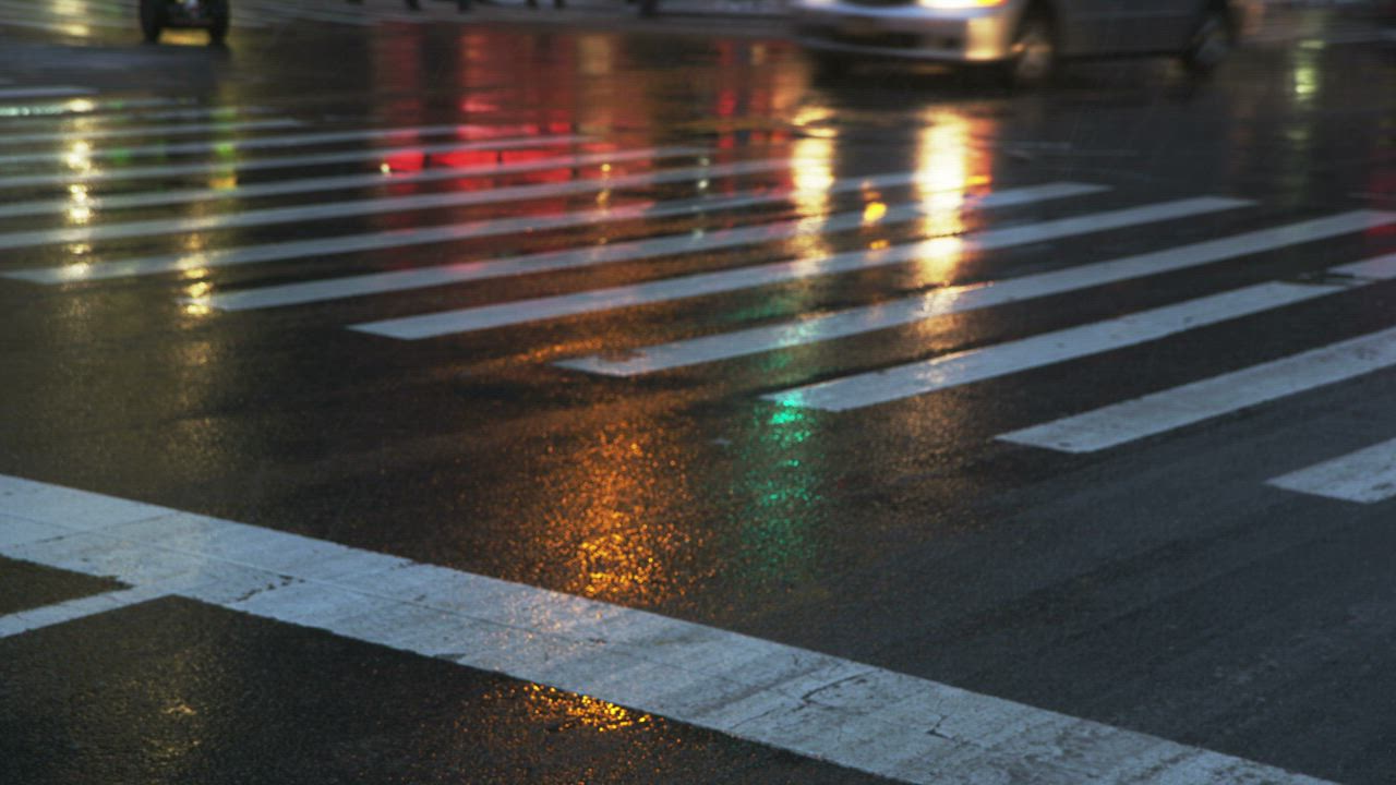
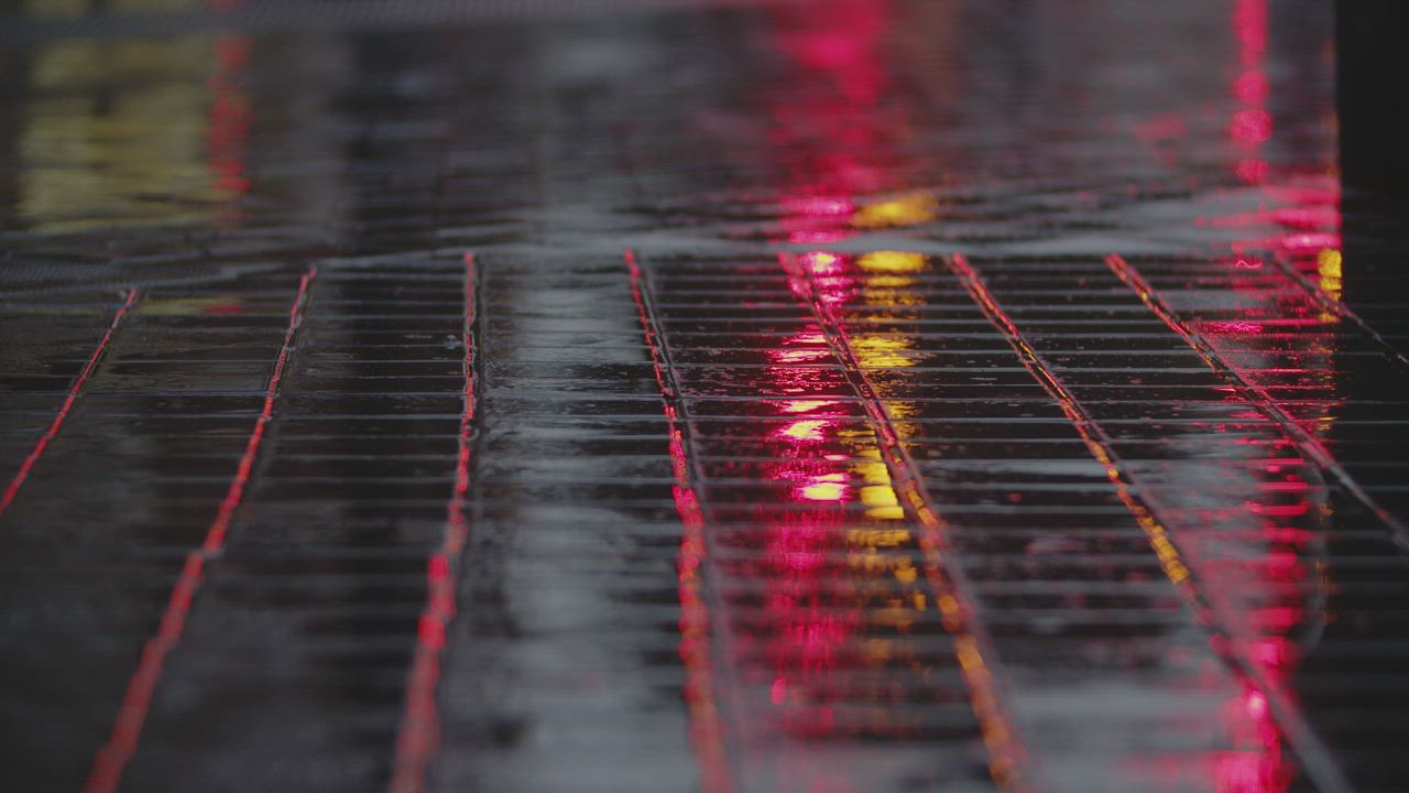
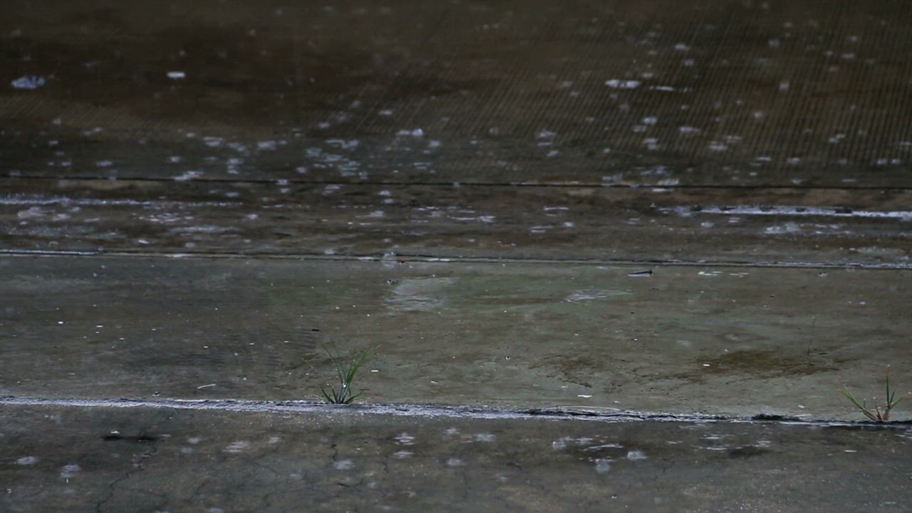
One prompt, four fictional video models. The clips run 7 to 21 seconds and line up by percentage, so halfway is halfway in all of them. Stack them and move up and down to flip between outputs on the same frame.
A paper boat drifting down a rain-soaked street
4 outputs · 16:9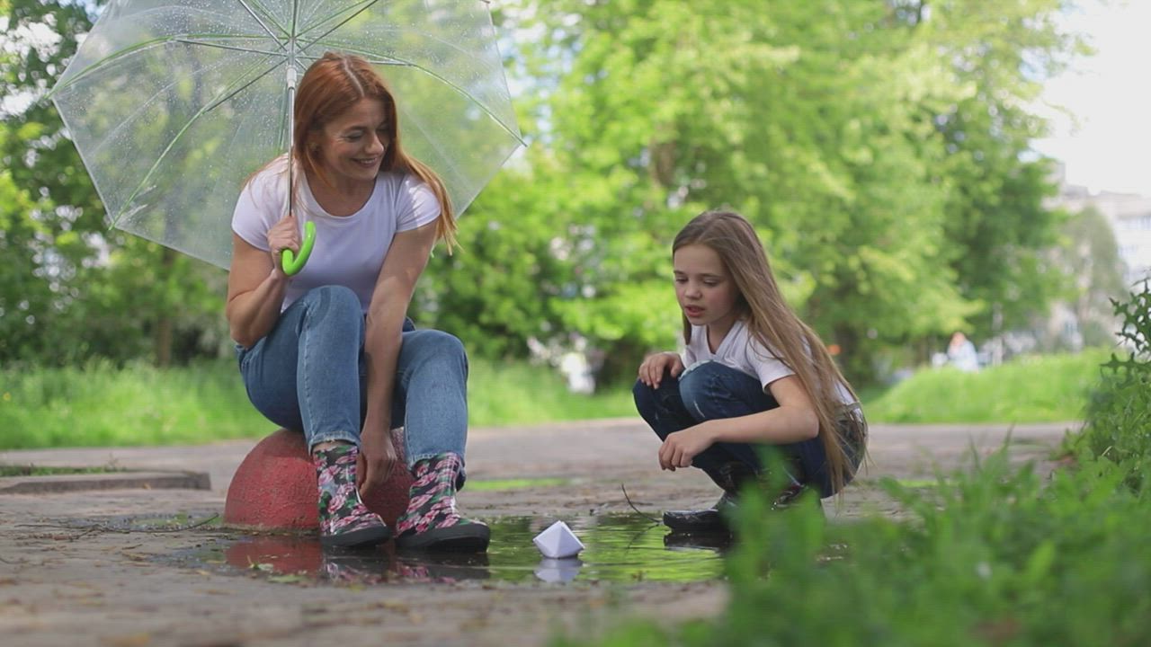
0.00s
Left and right arrows step through frames, Shift for ten. Up and down move between cards. Space plays.
import { SyncGrid, SyncGridItem } from "@/components/ui/sync-grid";

const prompt = "A paper boat drifting down a rain-soaked street";

// Four clips of different lengths, lined up by percentage: halfway through
// one is halfway through all of them.
const outputs = [
  { model: "Bramble 2", clip: 49029, time: "38s", cost: "$0.09" },
  { model: "Fernlight XL", clip: 17291, time: "1m 12s", cost: "$0.31" },
  { model: "Quarry", clip: 28088, time: "54s", cost: "$0.18" },
  { model: "Nimbus v4", clip: 31551, time: "27s", cost: "$0.06" },
];

const video = (id: number) => `https://assets.mixkit.co/videos/${id}/${id}-720.mp4`;
const poster = (id: number) => `https://assets.mixkit.co/videos/${id}/${id}-thumb-720-0.jpg`;

export function SyncGridModelsDemo() {
  return (
    <div className="w-full max-w-3xl">
      <div className="mb-4 flex items-center gap-3 rounded-2xl border border-zinc-200 bg-white px-3 py-2.5 shadow-sm dark:border-zinc-800 dark:bg-zinc-900">
        <span className="grid size-7 shrink-0 place-items-center rounded-lg bg-zinc-950 text-white dark:bg-white dark:text-zinc-950">
          <SparkIcon />
        </span>
        <p className="min-w-0 flex-1 truncate text-sm text-zinc-900 dark:text-zinc-100">{prompt}</p>
        <span className="hidden shrink-0 font-mono text-[11px] text-zinc-500 sm:block">4 outputs · 16:9</span>
      </div>

      <SyncGrid columns={2} duration={12}>
        {outputs.map((output) => (
          <SyncGridItem key={output.model} label={output.model} src={video(output.clip)} poster={poster(output.clip)}>
            <div className="absolute top-9 left-2.5 flex gap-1">
              <Stat>{output.time}</Stat>
              <Stat>{output.cost}</Stat>
            </div>
          </SyncGridItem>
        ))}
      </SyncGrid>
    </div>
  );
}

function Stat({ children }: { children: React.ReactNode }) {
  return (
    <span className="rounded-full bg-black/45 px-1.5 py-0.5 font-mono text-[10px] text-white/90 tabular-nums backdrop-blur-md">
      {children}
    </span>
  );
}

function SparkIcon() {
  return (
    <svg viewBox="0 0 16 16" aria-hidden className="size-3.5 fill-current">
      <path d="M8 1.5c.3 2.9 1.6 4.2 4.5 4.5-2.9.3-4.2 1.6-4.5 4.5-.3-2.9-1.6-4.2-4.5-4.5 2.9-.3 4.2-1.6 4.5-4.5ZM12.5 10c.15 1.4.75 2 2 2.1-1.25.15-1.85.75-2 2.15-.15-1.4-.75-2-2.1-2.15 1.35-.1 1.95-.7 2.1-2.1Z" />
    </svg>
  );
}
Render Quality
One clip in four cards at 1/8, 1/4, 1/2 and full resolution. It decodes once and is drawn into each card, so all four always show the same frame. Drag Final onto Draft and switch to Difference: only the detail the draft lost lights up.
Shot 04 · Lakeside · four render passes
Drag Final onto Draft, then switch to Difference
0.00s
Left and right arrows step through frames, Shift for ten. Up and down move between cards. Space plays.
import { SyncGrid, SyncGridItem } from "@/components/ui/sync-grid";

// One clip, decoded once and drawn at four resolutions, so every card shows
// exactly the same frame.
const src = "https://assets.mixkit.co/videos/33957/33957-720.mp4";
const poster = "https://assets.mixkit.co/videos/33957/33957-thumb-720-0.jpg";

const passes = [
  { label: "Draft", resolution: 1 / 8, size: "160 × 90", time: "0.4s / frame" },
  { label: "Preview", resolution: 1 / 4, size: "320 × 180", time: "1.1s / frame" },
  { label: "High", resolution: 1 / 2, size: "640 × 360", time: "4.8s / frame" },
  { label: "Final", resolution: 1, size: "1280 × 720", time: "19s / frame" },
];

export function SyncGridRenderDemo() {
  return (
    <div className="w-full max-w-3xl">
      <div className="mb-4 flex flex-wrap items-baseline justify-between gap-x-4 gap-y-1">
        <p className="text-sm font-medium text-zinc-900 dark:text-zinc-100">
          Shot 04 · Lakeside <span className="font-normal text-zinc-500">· four render passes</span>
        </p>
        <p className="text-xs text-zinc-500">Drag Final onto Draft, then switch to Difference</p>
      </div>

      <SyncGrid columns={2}>
        {passes.map((pass) => (
          <SyncGridItem key={pass.label} label={pass.label} src={src} poster={poster} resolution={pass.resolution}>
            <div className="absolute top-9 left-2.5 flex gap-1">
              <span className="rounded-full bg-black/45 px-1.5 py-0.5 font-mono text-[10px] text-white/90 tabular-nums backdrop-blur-md">
                {pass.size}
              </span>
              <span className="rounded-full bg-black/45 px-1.5 py-0.5 font-mono text-[10px] text-white/90 tabular-nums backdrop-blur-md">
                {pass.time}
              </span>
            </div>
          </SyncGridItem>
        ))}
      </SyncGrid>
    </div>
  );
}
Redesign
Three versions of one product's site, built from markup, each scrolling with the clock while the same visitor moves and clicks through it. Drag 2026 onto 2019 and slide the divider: the old and new layouts sit at the same scroll point.
tidely.app · three redesigns, one visit
Drag 2026 onto 2019 to compare
The smarter way to manage your team's calendar
Start free trialEverything you need
Simple pricing
Calendars that think ahead
Get startedWatch demo0.00s
Left and right arrows step through frames, Shift for ten. Up and down move between cards. Space plays.
"use client";
import * as React from "react";
import { easeInOut, motion, useTransform, type MotionValue } from "motion/react";
import { SyncGrid, SyncGridItem } from "@/components/ui/sync-grid";
/* Three versions of one product's site, built from markup. Every version
* keeps its sections on the same grid, so at any moment they're scrolled to
* the same part of the page, and the same visitor moves and clicks through
* all three.
*
* Sizes are in cqw, so a page scales with its card: a thumbnail in the grid,
* readable once two are merged to compare.
*
* page 180cqw tall, in a 57cqw window under a 5.5cqw toolbar
* 0–8 nav
* 8–62 hero, with the call to action
* 62–74 customers
* 74–126 features
* 126–172 pricing
* 172–180 footer
*/
const PAGE = 180;
const WINDOW = 57;
// When the visitor clicks, as shares of the clock.
const CLICK = { cta: 0.17, plan: 0.86 };
// How far down the page, over the clock: hero, then features, then pricing.
const SCROLL = { at: [0, 0.24, 0.46, 0.56, 0.8, 1], to: [0, 0, 0.45, 0.45, 1, 1] };
type Point = [x: number, y: number]; // cqw within the window
type Version = {
year: string;
page: React.ComponentType<{ progress: MotionValue<number> }>;
// Where the visitor's targets sit in the window when they're used.
targets: { cta: Point; feature: Point; plan: Point };
};
const versions: Version[] = [
{ year: "2019", page: Page2019, targets: { cta: [50, 35], feature: [50, 40], plan: [50, 34.5] } },
{ year: "2023", page: Page2023, targets: { cta: [15, 46], feature: [33, 36], plan: [60, 35] } },
{ year: "2026", page: Page2026, targets: { cta: [12, 42], feature: [80, 41], plan: [87, 25] } },
];
export function SyncGridRedesignDemo() {
return (
<div className="w-full max-w-4xl">
<div className="mb-4 flex flex-wrap items-baseline justify-between gap-x-4 gap-y-1">
<p className="text-sm font-medium text-zinc-900 dark:text-zinc-100">
tidely.app <span className="font-normal text-zinc-500">· three redesigns, one visit</span>
</p>
<p className="text-xs text-zinc-500">Drag 2026 onto 2019 to compare</p>
</div>
<SyncGrid columns={3} duration={8} aspect={16 / 10}>
{versions.map((version) => (
<SyncGridItem
key={version.year}
label={version.year}
render={(progress) => <Browser progress={progress} version={version} />}
/>
))}
</SyncGrid>
</div>
);
}
function Browser({ progress, version }: { progress: MotionValue<number>; version: Version }) {
const Page = version.page;
const scroll = useTransform(progress, SCROLL.at, SCROLL.to, { ease: easeInOut });
const y = useTransform(scroll, (s) => `${-s * (1 - WINDOW / PAGE) * 100}%`);
return (
<div className="@container absolute inset-0 overflow-hidden bg-zinc-100 dark:bg-zinc-800">
<div className="flex h-[5.5cqw] items-center gap-[0.9cqw] px-[2cqw]">
<span className="size-[1.3cqw] rounded-full bg-zinc-300 dark:bg-zinc-600" />
<span className="size-[1.3cqw] rounded-full bg-zinc-300 dark:bg-zinc-600" />
<span className="size-[1.3cqw] rounded-full bg-zinc-300 dark:bg-zinc-600" />
<span className="mx-auto rounded-full bg-white px-[3cqw] py-[0.5cqw] font-mono text-[1.6cqw] leading-none text-zinc-500 dark:bg-zinc-900 dark:text-zinc-400">
tidely.app
</span>
<span className="w-[5cqw]" />
</div>
<div className="absolute inset-x-0 top-[5.5cqw] bottom-0 overflow-hidden">
<motion.div className="h-[180cqw]" style={{ y }}>
<Page progress={progress} />
</motion.div>
<Cursor progress={progress} targets={version.targets} />
</div>
</div>
);
}
/** The visitor: to the call to action and click, a feature, then a plan and click. */
function Cursor({ progress, targets }: { progress: MotionValue<number>; targets: Version["targets"] }) {
const { cta, feature, plan } = targets;
const at = [0, 0.15, CLICK.cta, 0.3, 0.48, 0.6, 0.83, CLICK.plan, 1];
const xs = [80, cta[0], cta[0], 68, feature[0], 64, plan[0], plan[0], plan[0]];
const ys = [48, cta[1], cta[1], 24, feature[1], 18, plan[1], plan[1], plan[1]];
const x = useTransform(progress, at, xs.map((v) => `${v}cqw`), { ease: easeInOut });
const y = useTransform(progress, at, ys.map((v) => `${v}cqw`), { ease: easeInOut });
return (
<motion.div className="pointer-events-none absolute top-0 left-0" style={{ x, y }}>
<Ripple progress={progress} at={CLICK.cta} />
<Ripple progress={progress} at={CLICK.plan} />
<svg viewBox="0 0 24 24" className="relative size-[3.4cqw] -translate-x-[12%] -translate-y-[8%] drop-shadow">
<path
d="M4 2.5v16.2l4.3-4.1 2.8 6.3 2.7-1.2-2.8-6.2h6L4 2.5Z"
fill="white"
stroke="black"
strokeWidth="1.4"
strokeLinejoin="round"
/>
</svg>
</motion.div>
);
}
function Ripple({ progress, at }: { progress: MotionValue<number>; at: number }) {
const scale = useTransform(progress, [at, at + 0.06], [0.2, 1.6]);
const opacity = useTransform(progress, [at - 0.001, at, at + 0.06], [0, 0.7, 0]);
return (
<motion.span
className="absolute top-0 left-0 size-[6cqw] -translate-x-1/2 -translate-y-1/2 rounded-full border-[0.5cqw] border-sky-400"
style={{ scale, opacity }}
/>
);
}
/** A button that dips when the visitor clicks it. */
function Press({
progress,
at,
className,
children,
}: {
progress: MotionValue<number>;
at: number;
className?: string;
children: React.ReactNode;
}) {
const scale = useTransform(progress, [at - 0.004, at, at + 0.03, at + 0.05], [1, 0.92, 0.92, 1]);
const brightness = useTransform(progress, [at - 0.004, at, at + 0.03, at + 0.05], [1, 0.85, 0.85, 1]);
const filter = useTransform(brightness, (b) => `brightness(${b})`);
return (
<motion.span className={className} style={{ scale, filter }}>
{children}
</motion.span>
);
}
/** Lights up while the visitor rests on it. */
function useHover(progress: MotionValue<number>) {
return useTransform(progress, [0.45, 0.49, 0.57, 0.6], [0, 1, 1, 0]);
}
function Lines({ count = 2, className }: { count?: number; className?: string }) {
return (
<span className="flex w-full flex-col gap-[0.9cqw]">
{Array.from({ length: count }, (_, i) => (
<span key={i} className={className} style={{ width: `${i === count - 1 ? 62 : 100}%` }} />
))}
</span>
);
}
// ── 2019: the launch site. A blue gradient, centered, a stock product shot ──
function Page2019({ progress }: { progress: MotionValue<number> }) {
const shadow = useShadow(useHover(progress), "rgb(59 130 246 / 0.35)");
return (
<div className="h-full bg-white text-slate-800">
<div className="flex h-[8cqw] items-center justify-between border-b border-slate-200 px-[5cqw]">
<span className="flex items-center gap-[1cqw] text-[2.6cqw] font-bold text-slate-900">
<span className="size-[2.8cqw] rounded-[0.5cqw] bg-blue-600" /> tidely
</span>
<span className="flex items-center gap-[3cqw] text-[1.7cqw] text-slate-500">
<span>Features</span>
<span>Pricing</span>
<span>Blog</span>
<span className="rounded-[0.5cqw] bg-blue-600 px-[1.6cqw] py-[0.7cqw] text-white">Sign up</span>
</span>
</div>
<div className="flex h-[54cqw] flex-col items-center bg-gradient-to-br from-blue-600 to-indigo-700 px-[10cqw] pt-[6cqw] text-center text-white">
<p className="text-[4.4cqw] leading-[1.15] font-bold">The smarter way to manage your team's calendar</p>
<span className="mt-[2cqw] w-[60%]">
<Lines className="h-[1.3cqw] self-center rounded-full bg-white/40" />
</span>
<Press
progress={progress}
at={CLICK.cta}
className="mt-[3cqw] rounded-[0.6cqw] bg-white px-[3.2cqw] py-[1.4cqw] text-[1.9cqw] font-semibold text-blue-700 shadow-lg"
>
Start free trial
</Press>
<span className="mt-[4cqw] h-[14cqw] w-[56%] rounded-t-[1cqw] border-x-[0.8cqw] border-t-[0.8cqw] border-slate-800 bg-slate-100 p-[1.2cqw]">
<span className="grid h-full grid-cols-4 gap-[0.8cqw]">
<span className="col-span-1 rounded-[0.3cqw] bg-blue-200" />
<span className="col-span-3 rounded-[0.3cqw] bg-white" />
</span>
</span>
</div>
<div className="flex h-[12cqw] items-center justify-center gap-[5cqw] bg-slate-50">
{[10, 13, 9, 12, 11].map((w, i) => (
<span key={i} className="h-[2cqw] rounded-[0.4cqw] bg-slate-300" style={{ width: `${w}cqw` }} />
))}
</div>
<div className="h-[52cqw] px-[7cqw] pt-[6cqw]">
<p className="text-center text-[3.2cqw] font-bold text-slate-900">Everything you need</p>
<div className="mt-[4cqw] grid grid-cols-3 gap-[3cqw]">
{["bg-blue-500", "bg-emerald-500", "bg-amber-500"].map((color, i) => (
<motion.span
key={color}
className="flex flex-col items-center gap-[1.4cqw] rounded-[0.8cqw] border border-slate-200 p-[2.4cqw] text-center"
style={i === 1 ? { boxShadow: shadow } : undefined}
>
<span className={`size-[6cqw] rounded-full ${color}`} />
<span className="text-[1.9cqw] font-semibold">{["Smart sync", "Team view", "Reminders"][i]}</span>
<Lines count={3} className="h-[1cqw] rounded-full bg-slate-200" />
</motion.span>
))}
</div>
</div>
<div className="h-[46cqw] bg-slate-50 px-[7cqw] pt-[5cqw]">
<p className="text-center text-[3.2cqw] font-bold text-slate-900">Simple pricing</p>
<div className="mt-[3.5cqw] grid grid-cols-3 items-start gap-[2.5cqw]">
{["Free", "Team", "Business"].map((plan, i) => (
<span
key={plan}
className={`flex flex-col items-center gap-[1.2cqw] rounded-[0.8cqw] border bg-white p-[2.2cqw] ${i === 1 ? "border-blue-600 shadow-lg" : "border-slate-200"}`}
>
<span className="text-[1.8cqw] font-semibold">{plan}</span>
<span className="text-[3.4cqw] font-bold text-slate-900">${[0, 8, 16][i]}</span>
<Lines count={2} className="h-[0.9cqw] rounded-full bg-slate-200" />
{i === 1 ? (
<Press
progress={progress}
at={CLICK.plan}
className="mt-[0.6cqw] rounded-[0.5cqw] bg-blue-600 px-[2.4cqw] py-[1cqw] text-[1.6cqw] font-semibold text-white"
>
Choose plan
</Press>
) : (
<span className="mt-[0.6cqw] rounded-[0.5cqw] border border-slate-300 px-[2.4cqw] py-[1cqw] text-[1.6cqw]">
Choose plan
</span>
)}
</span>
))}
</div>
</div>
<div className="flex h-[8cqw] items-center justify-center bg-slate-900 text-[1.4cqw] text-slate-400">
© 2019 Tidely Inc.
</div>
</div>
);
}
// ── 2023: the rebrand. Dark, a glow, gradient type, a bento grid ──
function Page2023({ progress }: { progress: MotionValue<number> }) {
const shadow = useShadow(useHover(progress), "rgb(167 139 250 / 0.45)");
return (
<div className="relative h-full overflow-hidden bg-[#09090f] text-white">
<span className="absolute top-[4cqw] left-[46cqw] size-[46cqw] rounded-full bg-violet-600/45 blur-[10cqw]" />
<span className="absolute top-[18cqw] left-[66cqw] size-[30cqw] rounded-full bg-cyan-400/30 blur-[9cqw]" />
<div className="relative flex h-[8cqw] items-center justify-between px-[5cqw]">
<span className="text-[2.5cqw] font-semibold tracking-tight">tidely</span>
<span className="flex items-center gap-[1cqw] rounded-full bg-white/[0.06] p-[0.5cqw] text-[1.6cqw] text-white/60 ring-1 ring-white/10">
<span className="px-[1.4cqw]">Product</span>
<span className="px-[1.4cqw]">Pricing</span>
<span className="rounded-full bg-white px-[1.6cqw] py-[0.6cqw] text-[#09090f]">Log in</span>
</span>
</div>
<div className="relative h-[54cqw] px-[7cqw] pt-[6.5cqw]">
<span className="rounded-full bg-white/[0.07] px-[1.4cqw] py-[0.5cqw] text-[1.4cqw] text-white/70 ring-1 ring-white/10">
New · AI scheduling
</span>
<p className="mt-[2.4cqw] max-w-[62cqw] bg-gradient-to-r from-white via-violet-200 to-cyan-300 bg-clip-text text-[6cqw] leading-[1.02] font-semibold tracking-tight text-transparent">
Calendars that think ahead
</p>
<span className="mt-[2cqw] block w-[42cqw]">
<Lines className="h-[1.2cqw] rounded-full bg-white/20" />
</span>
<span className="mt-[3.4cqw] flex items-center gap-[1.6cqw]">
<Press
progress={progress}
at={CLICK.cta}
className="rounded-full bg-white px-[3cqw] py-[1.3cqw] text-[1.8cqw] font-semibold text-[#09090f]"
>
Get started
</Press>
<span className="rounded-full px-[2cqw] py-[1.3cqw] text-[1.8cqw] text-white/70 ring-1 ring-white/15">Watch demo</span>
</span>
</div>
<div className="relative flex h-[12cqw] items-center gap-[5cqw] px-[7cqw] opacity-40">
{[9, 12, 8, 11, 10].map((w, i) => (
<span key={i} className="h-[1.8cqw] rounded-full bg-white" style={{ width: `${w}cqw` }} />
))}
</div>
<div className="relative grid h-[52cqw] grid-cols-3 grid-rows-2 gap-[1.6cqw] px-[7cqw] pt-[2cqw] pb-[4cqw]">
<motion.span
className="col-span-2 rounded-[1.6cqw] bg-white/[0.05] p-[2.4cqw] ring-1 ring-white/10"
style={{ boxShadow: shadow }}
>
<span className="block text-[2.2cqw] font-semibold">Auto-schedule</span>
<span className="mt-[2cqw] grid grid-cols-5 gap-[0.8cqw]">
{Array.from({ length: 10 }, (_, i) => (
<span key={i} className={`h-[3cqw] rounded-[0.5cqw] ${i % 3 === 0 ? "bg-violet-500/70" : "bg-white/10"}`} />
))}
</span>
</motion.span>
<span className="row-span-2 rounded-[1.6cqw] bg-gradient-to-b from-violet-500/30 to-cyan-400/10 p-[2.4cqw] ring-1 ring-white/10">
<span className="block text-[2.2cqw] font-semibold">Focus time</span>
<span className="mt-[2cqw] block w-full">
<Lines count={4} className="h-[1cqw] rounded-full bg-white/20" />
</span>
</span>
<span className="rounded-[1.6cqw] bg-white/[0.05] p-[2.4cqw] ring-1 ring-white/10">
<span className="block text-[2cqw] font-semibold">Time zones</span>
</span>
<span className="rounded-[1.6cqw] bg-white/[0.05] p-[2.4cqw] ring-1 ring-white/10">
<span className="block text-[2cqw] font-semibold">Insights</span>
</span>
</div>
<div className="relative grid h-[46cqw] grid-cols-2 gap-[2.4cqw] px-[14cqw] pt-[4cqw]">
{["Starter", "Team"].map((plan, i) => (
<span
key={plan}
className={`flex h-[34cqw] flex-col rounded-[1.8cqw] p-[2.8cqw] ring-1 ${i === 1 ? "bg-gradient-to-b from-violet-500/25 to-transparent ring-violet-400/50" : "bg-white/[0.04] ring-white/10"}`}
>
<span className="text-[1.8cqw] text-white/70">{plan}</span>
<span className="mt-[1cqw] text-[4.4cqw] font-semibold">${[0, 12][i]}</span>
<span className="mt-[1.6cqw] w-full">
<Lines count={3} className="h-[1cqw] rounded-full bg-white/15" />
</span>
{i === 1 ? (
<Press
progress={progress}
at={CLICK.plan}
className="mt-auto self-start rounded-full bg-white px-[2.6cqw] py-[1.1cqw] text-[1.6cqw] font-semibold text-[#09090f]"
>
Start trial
</Press>
) : (
<span className="mt-auto self-start rounded-full px-[2.6cqw] py-[1.1cqw] text-[1.6cqw] ring-1 ring-white/20">
Get started
</span>
)}
</span>
))}
</div>
<div className="relative flex h-[8cqw] items-center px-[7cqw] text-[1.4cqw] text-white/35">© 2023 Tidely</div>
</div>
);
}
// ── 2026: today. Editorial, warm paper, the product itself as the hero ──
function Page2026({ progress }: { progress: MotionValue<number> }) {
const tint = useTint(useHover(progress));
return (
<div className="h-full bg-[#f6f3ee] text-stone-900 dark:bg-[#16140f] dark:text-stone-100">
<div className="flex h-[8cqw] items-center justify-between border-b border-stone-900/10 px-[5cqw] dark:border-white/10">
<span className="font-serif text-[2.8cqw] italic">Tidely</span>
<span className="flex items-center gap-[3cqw] text-[1.6cqw] text-stone-500">
<span>Product</span>
<span>Pricing</span>
<span className="text-stone-900 dark:text-stone-100">Sign in →</span>
</span>
</div>
<div className="grid h-[54cqw] grid-cols-[1.1fr_1fr] gap-[4cqw] px-[5cqw] pt-[7cqw]">
<span className="flex flex-col">
<span className="font-mono text-[1.3cqw] tracking-widest text-orange-600 uppercase">Calendar, rethought</span>
<span className="mt-[1.6cqw] font-serif text-[6.4cqw] leading-[0.98] tracking-tight">
Time, held together.
</span>
<span className="mt-[2.2cqw] w-[80%]">
<Lines className="h-[1.1cqw] rounded-full bg-stone-900/15 dark:bg-white/15" />
</span>
<Press
progress={progress}
at={CLICK.cta}
className="mt-[3cqw] self-start rounded-full bg-stone-900 px-[2.8cqw] py-[1.3cqw] text-[1.7cqw] font-medium text-[#f6f3ee] dark:bg-[#f6f3ee] dark:text-stone-900"
>
Try Tidely
</Press>
</span>
<span className="mt-[1cqw] h-[38cqw] rounded-[1.2cqw] bg-white p-[1.6cqw] shadow-[0_2cqw_5cqw_-2cqw_rgb(0_0_0/0.25)] ring-1 ring-stone-900/10 dark:bg-stone-900 dark:ring-white/10">
<span className="grid h-full grid-cols-5 gap-[0.6cqw]">
{Array.from({ length: 5 }, (_, day) => (
<span key={day} className="relative rounded-[0.4cqw] bg-stone-100 dark:bg-white/[0.04]">
<span
className="absolute inset-x-[10%] rounded-[0.4cqw] bg-orange-400/80"
style={{ top: `${[12, 40, 22, 60, 30][day]}%`, height: `${[22, 18, 30, 16, 24][day]}%` }}
/>
<span
className="absolute inset-x-[10%] rounded-[0.4cqw] bg-lime-400/80"
style={{ top: `${[56, 8, 66, 20, 70][day]}%`, height: `${[14, 20, 12, 22, 14][day]}%` }}
/>
</span>
))}
</span>
</span>
</div>
<div className="flex h-[12cqw] items-center gap-[5cqw] border-y border-stone-900/10 px-[5cqw] dark:border-white/10">
<span className="font-mono text-[1.2cqw] text-stone-500 uppercase">Trusted by</span>
{[8, 11, 9, 10].map((w, i) => (
<span key={i} className="h-[1.6cqw] rounded-full bg-stone-900/20 dark:bg-white/20" style={{ width: `${w}cqw` }} />
))}
</div>
<div className="h-[52cqw] px-[5cqw] pt-[5cqw]">
<span className="font-serif text-[3.6cqw]">What it does</span>
<span className="mt-[3cqw] grid grid-cols-3 gap-[3cqw]">
{["Plans the week", "Guards focus", "Speaks every zone"].map((title, i) => (
<motion.span
key={title}
className="flex flex-col gap-[1.2cqw] rounded-[0.8cqw] border-t border-stone-900/20 pt-[1.6cqw] dark:border-white/20"
style={i === 2 ? { backgroundColor: tint } : undefined}
>
<span className="font-mono text-[1.3cqw] text-orange-600">0{i + 1}</span>
<span className="text-[2.2cqw] font-medium">{title}</span>
<Lines count={3} className="h-[1cqw] rounded-full bg-stone-900/10 dark:bg-white/10" />
</motion.span>
))}
</span>
</div>
<div className="h-[46cqw] px-[5cqw] pt-[4cqw]">
<span className="font-serif text-[3.6cqw]">Pricing</span>
<span className="mt-[3cqw] grid grid-cols-2 border-t border-stone-900/20 dark:border-white/20">
{["Personal", "Team"].map((plan, i) => (
<span
key={plan}
className={`flex items-center justify-between py-[3cqw] pr-[2cqw] ${i === 1 ? "border-l border-stone-900/20 pl-[3cqw] dark:border-white/20" : ""}`}
>
<span className="flex flex-col">
<span className="text-[2.2cqw] font-medium">{plan}</span>
<span className="font-serif text-[4cqw]">{["Free", "$10"][i]}</span>
</span>
{i === 1 ? (
<Press
progress={progress}
at={CLICK.plan}
className="rounded-full bg-orange-500 px-[2.4cqw] py-[1.2cqw] text-[1.6cqw] font-medium text-white"
>
Choose
</Press>
) : null}
</span>
))}
</span>
</div>
<div className="flex h-[8cqw] items-center justify-between px-[5cqw] font-mono text-[1.2cqw] text-stone-500">
<span>Tidely, 2026</span>
<span>Made with care</span>
</div>
</div>
);
}
function useShadow(hover: MotionValue<number>, color: string) {
return useTransform(hover, (h) => `0 0 0 ${h * 0.4}cqw ${color}, 0 ${h * 1.6}cqw ${h * 4}cqw -${h}cqw ${color}`);
}
function useTint(hover: MotionValue<number>) {
return useTransform(hover, (h) => `rgb(249 115 22 / ${h * 0.12})`);
}
Props
| Prop | Type | Default | Description |
|---|---|---|---|
columns | number | 2 | Cards per row. |
duration | number | None | Length of the timeline in seconds. Drives render items and playback. Videos of any length are matched to it by percentage, so a 10s and a 30s clip both reach their middle at the timeline's middle. Defaults to the first video's length, or 4 with no video. |
fps | number | 30 | Frame rate of the timeline: the step for ← and → (Shift: ten frames), and the frame every card lands on together once scrubbing stops. |
aspect | number | 16 / 9 | Width ÷ height of every card. Videos and sprites cover it. |
ripple | boolean | true | Followers chase the card you're scrubbing on springs that slow with each cell of distance, so time travels outward like a wave, and all land on the same frame within 150ms of the pointer stopping. Off with reduced motion. |
stackable | boolean | true | Show the Stack button. Stacked, the cards fan into one frame: x scrubs, y (or ↑ ↓, or the list beside it) picks the variant in front, which swaps in a 100ms crossfade. |
comparable | boolean | true | Drag a card onto another (long-press on touch, or the Compare button on a focused card) to merge them into one frame with a draggable divider, or into Difference, where identical pixels go black. |
hint | boolean | true | The first time the grid scrolls into view, a ghost cursor sweeps the first card once. Cancelled by any pointer or key; skipped with reduced motion. |
onTimeChange | (seconds: number, progress: number) => void | None | Called whenever the clock moves, with the time in seconds and as 0–1. Runs every frame while playing or scrubbing. |
cardClassName | string | None | Classes for every card, such as its corner radius. Defaults to rounded-xl. |
className | string | None | Extra classes for the outer element. Other div props pass through. |
item.labelRequired | string | None | SyncGridItem: names the card on screen, in the stack's list, and to screen readers. |
item.render | (progress: MotionValue<number>) => ReactNode | None | SyncGridItem: draws the card from the clock with no assets. Gets this card's progress, 0–1, as a MotionValue; bind it to motion styles or useTransform so nothing re-renders per frame. |
item.src | string | None | SyncGridItem: a video. Loads once the grid is within a screen of the viewport. Cards that share a src decode it once and draw the same frame. |
item.poster | string | None | SyncGridItem: shown until the video's first frame is ready. |
item.sprite | { url: string; columns: number; rows: number; frames?: number } | None | SyncGridItem: a sheet of preview frames, left to right then top to bottom, used while scrubbing. With src, the video only loads to play. |
item.resolution | number | 1 | SyncGridItem: 0–1. Draws the video at that share of its own pixels (1/8 of 1280 × 720 is 160 × 90) and scales it up pixelated. |
item.children | ReactNode | None | SyncGridItem: overlay content such as stat chips, over the media. Position it yourself; it takes no pointer events and hides in Difference view. |
item.className | string | None | SyncGridItem: classes for this card. |
columnsType
numberDefault2Cards per row.
durationType
numberLength of the timeline in seconds. Drives
renderitems and playback. Videos of any length are matched to it by percentage, so a 10s and a 30s clip both reach their middle at the timeline's middle. Defaults to the first video's length, or 4 with no video.fpsType
numberDefault30Frame rate of the timeline: the step for ← and → (Shift: ten frames), and the frame every card lands on together once scrubbing stops.
aspectType
numberDefault16 / 9Width ÷ height of every card. Videos and sprites cover it.
rippleType
booleanDefaulttrueFollowers chase the card you're scrubbing on springs that slow with each cell of distance, so time travels outward like a wave, and all land on the same frame within 150ms of the pointer stopping. Off with reduced motion.
stackableType
booleanDefaulttrueShow the Stack button. Stacked, the cards fan into one frame: x scrubs, y (or ↑ ↓, or the list beside it) picks the variant in front, which swaps in a 100ms crossfade.
comparableType
booleanDefaulttrueDrag a card onto another (long-press on touch, or the Compare button on a focused card) to merge them into one frame with a draggable divider, or into Difference, where identical pixels go black.
hintType
booleanDefaulttrueThe first time the grid scrolls into view, a ghost cursor sweeps the first card once. Cancelled by any pointer or key; skipped with reduced motion.
onTimeChangeType
(seconds: number, progress: number) => voidCalled whenever the clock moves, with the time in seconds and as 0–1. Runs every frame while playing or scrubbing.
cardClassNameType
stringClasses for every card, such as its corner radius. Defaults to
rounded-xl.classNameType
stringExtra classes for the outer element. Other
divprops pass through.item.labelRequiredType
stringSyncGridItem: names the card on screen, in the stack's list, and to screen readers.item.renderType
(progress: MotionValue<number>) => ReactNodeSyncGridItem: draws the card from the clock with no assets. Gets this card's progress, 0–1, as a MotionValue; bind it tomotionstyles oruseTransformso nothing re-renders per frame.item.srcType
stringSyncGridItem: a video. Loads once the grid is within a screen of the viewport. Cards that share asrcdecode it once and draw the same frame.item.posterType
stringSyncGridItem: shown until the video's first frame is ready.item.spriteType
{ url: string; columns: number; rows: number; frames?: number }SyncGridItem: a sheet of preview frames, left to right then top to bottom, used while scrubbing. Withsrc, the video only loads to play.item.resolutionType
numberDefault1SyncGridItem: 0–1. Draws the video at that share of its own pixels (1/8 of 1280 × 720 is 160 × 90) and scales it up pixelated.item.childrenType
ReactNodeSyncGridItem: overlay content such as stat chips, over the media. Position it yourself; it takes no pointer events and hides in Difference view.item.classNameType
stringSyncGridItem: classes for this card.